


10 Creative 404 Page Designs for Inspiration
Category: Web Design

7 mins read
We've all encountered a 404 page at some point while browsing the web. It's that annoying page that appears when we click on a broken link or mistype a URL. However, 404 pages don't have to be boring or frustrating. In fact, they present a unique opportunity to showcase your brand's personality and creativity. In this article, we'll explore what a 404 page is and share 10 of the best examples from around the web. Get ready to be inspired for 404 page design!
In this article:
Part 1. What Is a 404 Page
When browsing a website, you may occasionally come across a "404 error" or a "404 page." This page appears when you try to access a webpage that doesn't exist or can't be found. It's a common occurrence on the internet, and it happens for a variety of reasons, such as a typo in the URL or a broken link.
A 404 page is essentially a notification from the server that the page you're trying to access is unavailable. It's important to note that a 404 error is not the same as a "500 error," which means that there is an issue with the server itself. In contrast, a 404 error is caused by a problem with the client's request.
While 404 errors can be frustrating for users, they serve a critical function in helping webmasters manage their websites. Without a 404 error message, users may not realize that the page they're trying to access doesn't exist, and webmasters would have a more challenging time identifying and fixing broken links on their site.
That being said, a 404 page doesn't have to be a dead end for users. With a well-designed 404 page, webmasters can provide users with helpful information, guidance, or entertainment that can improve the user experience and keep them engaged with the website. A good 404 page can even turn a negative experience into a positive one and increase user retention.
Part 2. 10 examples of 404 pages
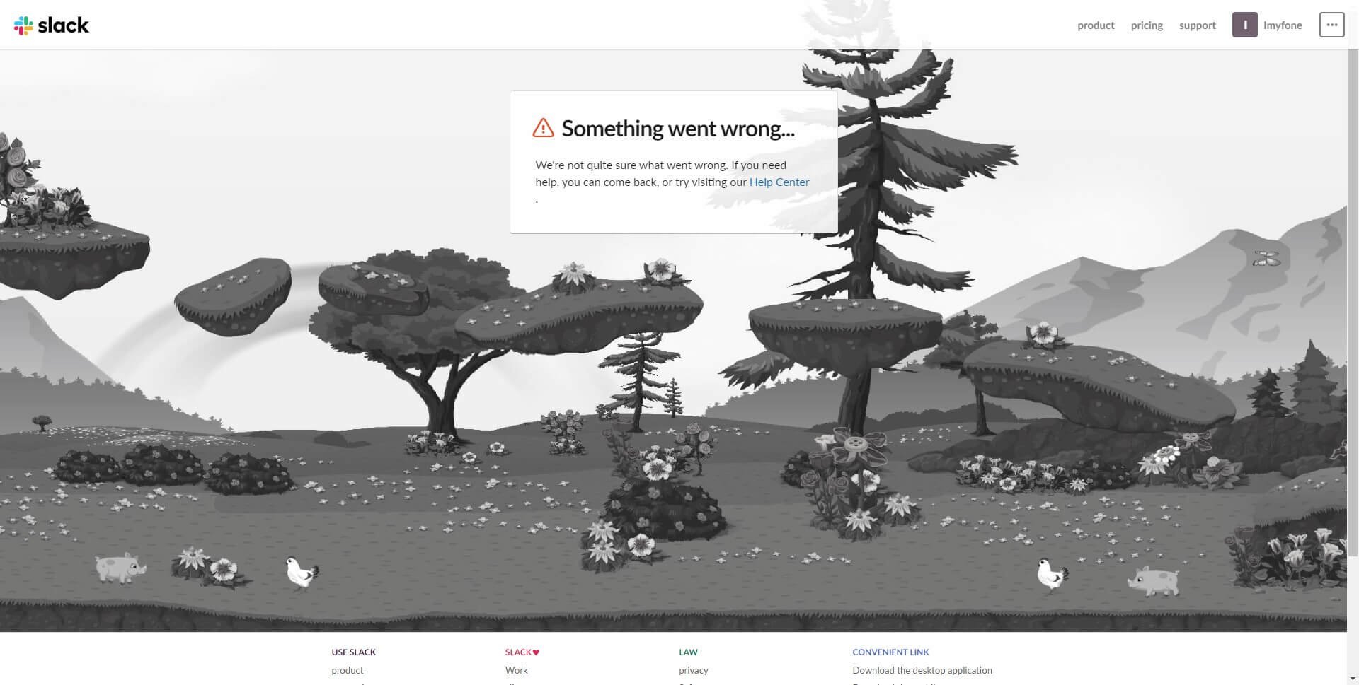
1. Slack
Slack's 404 error page features a simple yet effective design that incorporates several key elements to ensure users are not left feeling frustrated or confused.
The page is branded with Slack's signature color scheme, which helps to maintain a consistent visual identity for users. It features a friendly message that acknowledges the user's frustration and invites them to return to the homepage or perform a search for the content they were looking for. Additionally, the page includes a helpful search bar prominently placed on the page, which allows users to easily find the content they were searching for.
One of the most notable elements of Slack's 404 page is the clever use of humor to alleviate the frustration that users may be experiencing. The page features an animated image of a broken robot, with the caption "Uh-oh, you've found our broken robot" which serves to humanize the experience and make users feel more at ease. The use of humor in this context can help to reduce user anxiety and create a positive experience that users will remember.
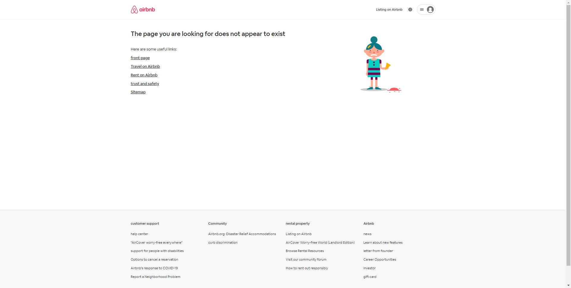
2. Airbnb
Airbnb's 404 not found design is an excellent example of how to make a potentially frustrating experience a little more pleasant. When a user stumbles upon an Airbnb page that no longer exists or is temporarily down, the 404 page takes over, and it is clear that the website has thoughtfully put together this page.
The page's central image features a whimsical, slightly pixelated version of Airbnb's logo, which immediately grabs attention and conveys a lightheartedness that helps to diffuse any frustration. The message, "Uh oh, looks like that page doesn't exist," is displayed prominently beneath the logo, so the user knows exactly what has happened.
Underneath the message, there are a few links to other sections of the site, including the homepage, search, and help center, which help to guide the user towards a more productive path. Additionally, there is a search bar that encourages the user to try searching again, which is a smart move since it reminds them that there are plenty of other options to explore on Airbnb.
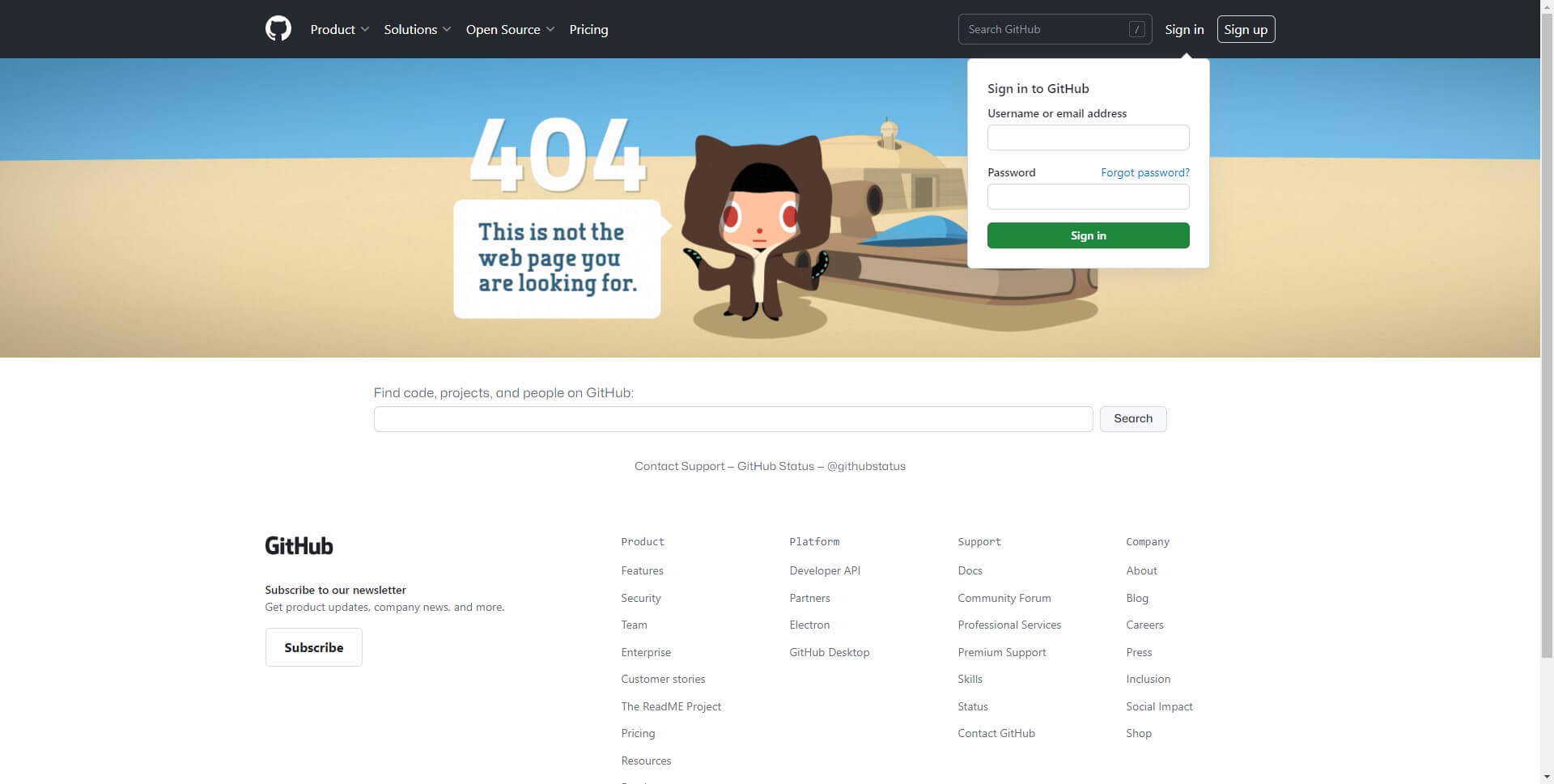
3. GitHub
GitHub's page not found design is a great example of effective design and user experience. As soon as you land on the page, you're greeted with a playful and friendly illustration of a lost astronaut floating in space. This immediately sets a light-hearted tone and communicates to the user that they're not alone in their error.
The main message on the page is also clear and concise: "This is not the web page you are looking for". The use of Star Wars reference adds to the playful tone and helps to create a connection with the user. Below the message, there are three options for the user to choose from, each represented by a button: "Go home", "Back to previous page", and "Contact support". This provides the user with clear and actionable steps to take next, and ensures they don't feel stuck or helpless.
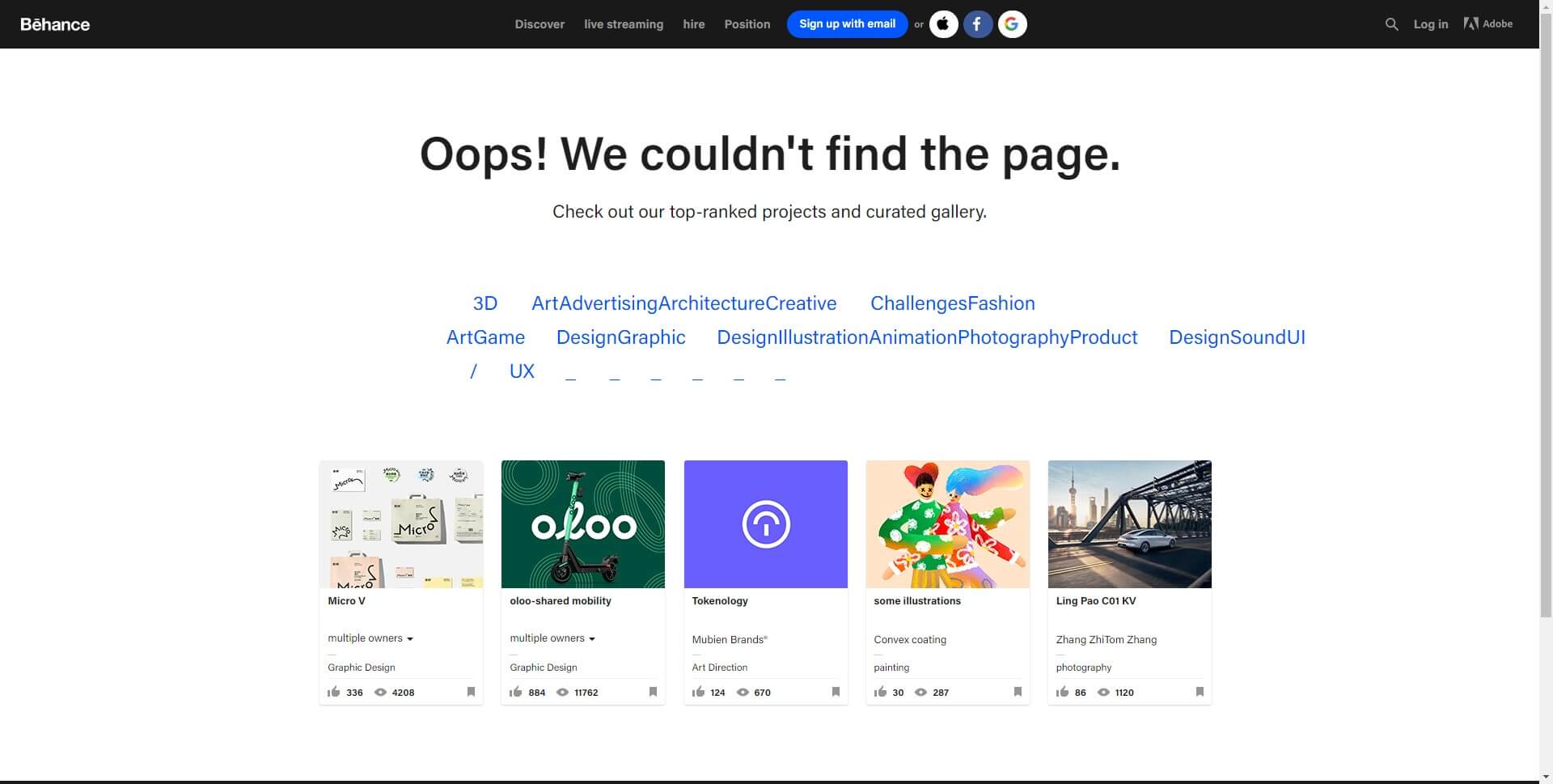
4. Behance
Behance, the online platform for creative professionals, has a distinctive 404 page that catches the eye of its visitors. The page features a bold and colorful illustration of an astronaut floating in space with the words "Oops! Looks like this page got lost in space" written in a playful font.
The page also includes a search bar, allowing users to search for the content they were originally looking for. Additionally, there are several links to popular pages on the Behance website, encouraging users to continue exploring the site even if they didn't find what they were initially looking for.
The use of an astronaut in the illustration could imply that the missing page is a temporary setback in the user's journey through the website, rather than a dead-end. The playful tone and colorful design also convey a sense of positivity and encouragement to continue exploring the site.
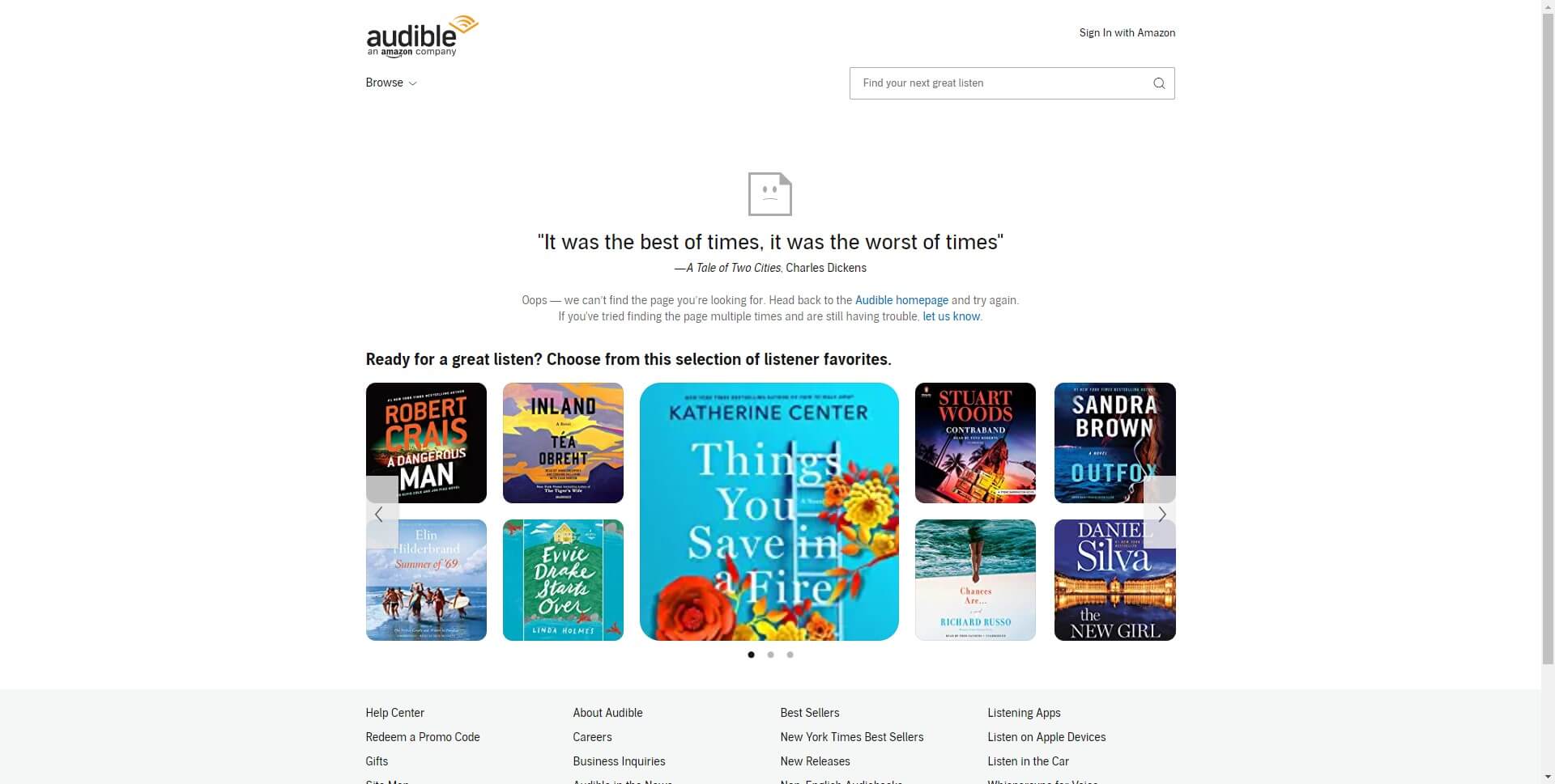
5. Audible
Audible's 404 page is quirky and humorous, featuring a cartoon of a confused-looking owl. At first glance, Audible's 404 page appears quite simple, with minimal text and graphics. The page features the brand's iconic orange color scheme and a friendly message that reads, "Oops! We couldn't find the page you're looking for."
Despite its simplicity, Audible's 404 page effectively communicates the brand's personality and values. The friendly tone and use of the word "Oops!" convey a sense of approachability and humility. By acknowledging the mistake and taking responsibility for the error, Audible is able to build trust with its users and prevent frustration or confusion.
In addition to the text, Audible's 404 page also features a search bar and navigation menu, allowing users to easily navigate to another page on the site. This not only helps to keep users engaged with the site, but also improves the overall user experience by providing a clear path forward.
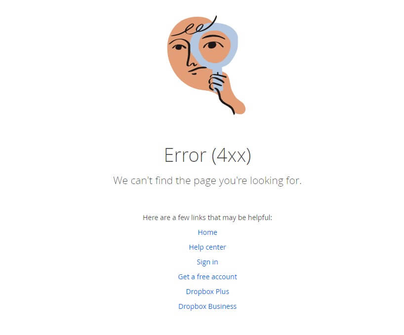
6. Dropbox
The Dropbox 404 page is clean, minimalistic, and eye-catching. It features a simple message in bold white letters on a black background, stating "404. Page Not Found." The font is large and easy to read, making it clear to the user that they have landed on an error page. The page also includes a link back to the Dropbox homepage, as well as a search bar that allows users to easily search for what they were originally looking for.
What's notable about the Dropbox 404 page is its creative use of imagery. The page features a cartoon drawing of a UFO beaming up a cow, with the words "Oops, the page you're looking for doesn't exist." This whimsical image adds a touch of humor and personality to an otherwise frustrating experience. It also suggests that the error is not the user's fault and helps to lighten the mood.
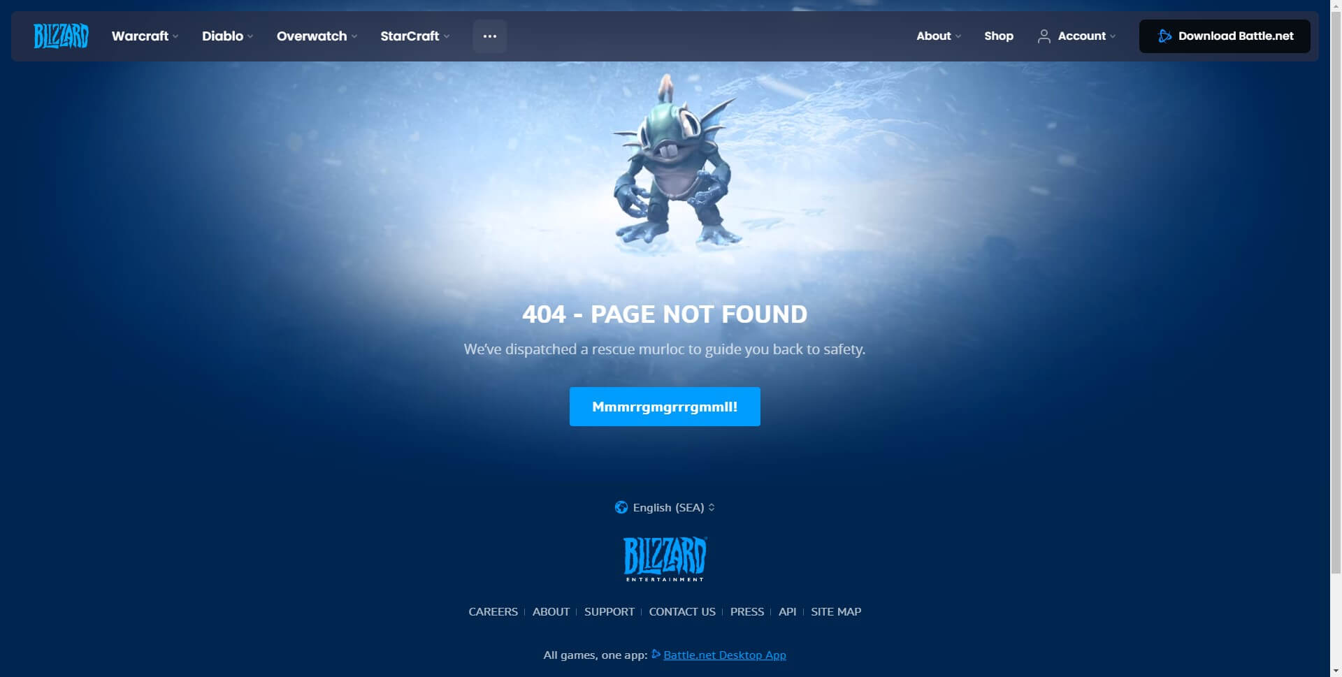
7. Blizzard Entertainment
Blizzard Entertainment is known for its high-quality video games, and their website is no exception. Even their 404 page design is impressive and shows a lot of attention to detail. The first thing that catches the eye is the colorful banner with the Blizzard Entertainment logo, which creates a sense of familiarity for users. The background is a simple blue gradient, which is calming and easy on the eyes.
The main message on the page reads "Error 404: Page Not Found," which is straightforward and easy to understand. Below that, there is a humorous message that reads "Sargeras has taken this page captive," which is a reference to one of their popular games, World of Warcraft. This message adds some personality to the page and makes it more engaging.
Another interesting element of the Blizzard Entertainment 404 page design is the search bar located prominently in the middle of the page. This allows users to quickly search for what they were looking for and prevents them from leaving the site altogether. The footer of the page includes links to various sections of the Blizzard Entertainment website, which is helpful for users who may be interested in exploring more content.
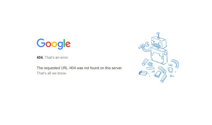
8. Google
Upon landing on Google's 404 page, users are greeted with a simple message that reads "404. That’s an error. The requested URL was not found on this server." The message is accompanied by an illustration of a sad-looking robot holding a broken piece of metal, which adds a playful touch to an otherwise frustrating experience.
One of the key elements of Google's 404 page design is its simplicity. There are no distracting elements or complex graphics that may confuse the user. Instead, the message and illustration are front and center, making it clear what has gone wrong.
Another element worth noting is the use of Google's brand colors - blue, red, yellow, and green - in the illustration. This not only reinforces the brand but also adds a sense of familiarity and reassurance to the user.
However, the most notable aspect of Google's 404 page design is the subtle humor it employs. While the error message is straightforward, the robot illustration and accompanying message "That’s all we know" give a lighthearted nod to the fact that errors can happen, and it's not the end of the world.
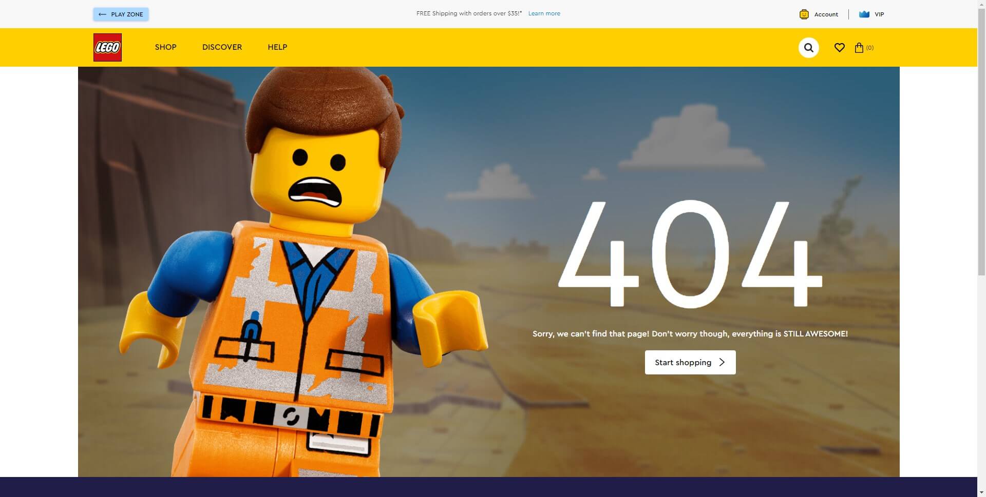
9. Lego
The Lego 404 page features a playful and colorful design that incorporates elements of the iconic Lego brick.
One of the most prominent features of the Lego 404 page is the giant Lego brick that takes up most of the screen. This brick is made up of several smaller bricks of different colors, which creates a visually striking and attention-grabbing effect. The brick also features the number "404" in bold white letters, which lets users know that they have landed on an error page.
In addition to the giant Lego brick, the 404 page also includes a short and friendly message that apologizes for the error and encourages users to explore the site further. The message is written in a clear and conversational tone, which helps to humanize the brand and make it more relatable to users.
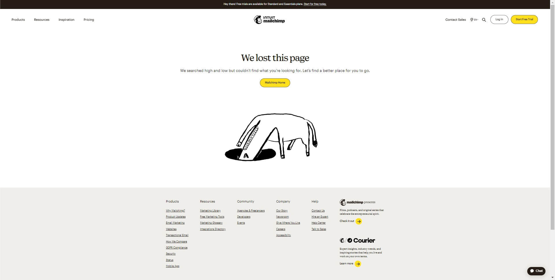
10. Mailchimp
Mailchimp's 404 page is a great example of how to create an engaging user experience out of an error message. The page features a playful and colorful design, with a prominent search bar and links to popular resources. The use of the Mailchimp logo and monkey illustration ties into the brand's identity. Overall, Mailchimp's 404 page effectively diffuses any frustration or confusion a user might feel, providing clear instructions on what to do next and encouraging users to stay on the site.
Conclusion
In this article, we've introduced the concept of a 404 page and highlighted its importance in improving the user experience of your website. We've shared 10 examples of creative and memorable 404 pages from various websites, which can inspire you to design your own. With these examples, you can turn a frustrating error page into a fun and engaging experience that reflects your brand's personality.