


 Shop
Shop
Top 10 Website Layouts in 2023
Category: Web Design

8 mins read
Visually appealing websites can improve user experience and keep them returning to your website. However, to create a catchy website, you must give it a solid foundation. It means you need a functional website layout that pumps brilliance into the website's overall appeal.
Simply put, a well-designed website layout that communicates information clearly and easily can make or break its success. So, we've compiled a list of the best website layouts commonly used by professional designers to attract visitors.
In this article:
- Part 1. What is A Website Layout
- Part 2. Top 10 Website Layout in 2023
- The Zig-Zag Layout
- F-Shaped Layout
- Full-Screen Image Layout
- Split Screen Layout
- Asymmetrical Layout
- Single Column Layout
- Magazine Layout
- Card Layout
- Grid Layout
- Featured Image Website Layout
- Part 3. Tips for Website Layout Design
- Part 4. FAQs
Part 1. What is a Website Layout
A website layout refers to the structure and arrangement of all visual elements on a webpage. It includes the positioning of text, images, menu navigation, and other content on the page. A web layout also defines the overall design and aesthetics of the site.
The role of website layout is to organize and arrange the information available. By clarifying the information hierarchy on a webpage, a website layout optimizes user experience and even enhances a website’s usability. It can direct visitors toward the most significant content first and then through the following sections in order of importance.
Furthermore, the web layout can boost the design and produce engaging interactions. A well-organized webpage also proves that the business aims to keep up with the current web design and user trends.
Part 2. Top 10 Website Layout in 2023
Finally, here are the top 10 best website layouts to help you mark your presence on Google. Whether you are designing a website from scratch or want to revamp your current one, these website layouts will surely give you a strong start.
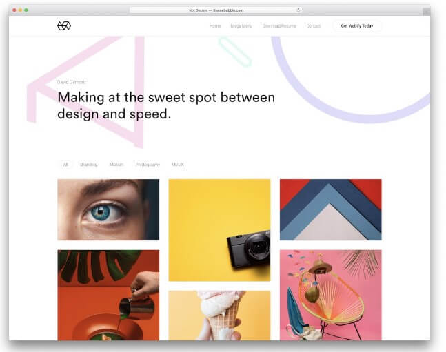
1. The Zig-Zag Layout
When we open a new webpage, we quickly scan it to get an overall idea of its content. The rapid scanning strategy, more commonly known as skim reading, typically follows a zig-zag or "Z" shaped pattern. And so, the z-shaped layout snippet mimics the skim reading behavior by arranging all the necessary elements in a z-shape pattern across the webpage:
- First, people scan the page from left to right, making a horizontal line.
- Then, the eyes move down to the left side of the page, forming the diagonal line of the letter Z.
- Finally, the eyes wander back to the right again, creating the second horizontal line.
A zig-zag layout snippet gives you a two-column layout with multiple rows. The featured images are adjusted alternatively from right to left, along with the text. A well-designed Z-shaped website layout produces rhythmic and captivating reading patterns for visitors.
This website design concept works exceptionally well for pages that rely heavily on visual elements. It is also ideal for landing pages that have a clear conversion objective.
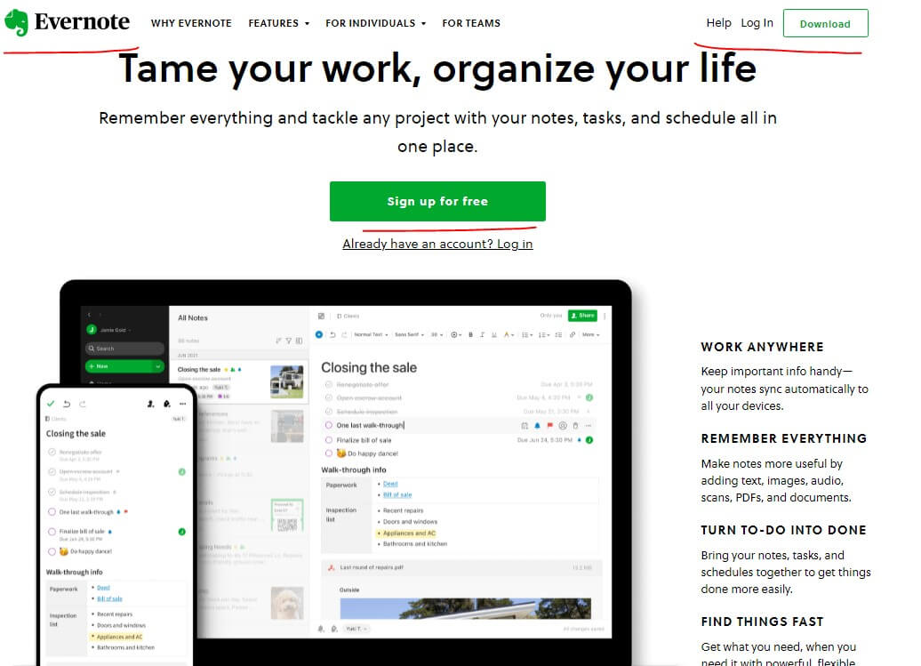
Example: Evernote
Features of Zig-Zag Layout Websites:
A zigzag webpage is divided into three sections (look at the picture above) including:
- The logo is placed in the upper right corner of the page, ensuring the company's name is instantly branded into the mind of the readers. On the other hand, the navigation menu and call-to-action (CTA) are placed in the top-left corner of the page.
- Then comes the diagonal part that spans from the top to the bottom of the page. This part includes the most attention-grabbing information. Web designers usually add eye-catching graphics and crisp text that accurately portrays the website's purpose.
- Finally, a CTA is placed in the middle of the page for a more professional look.
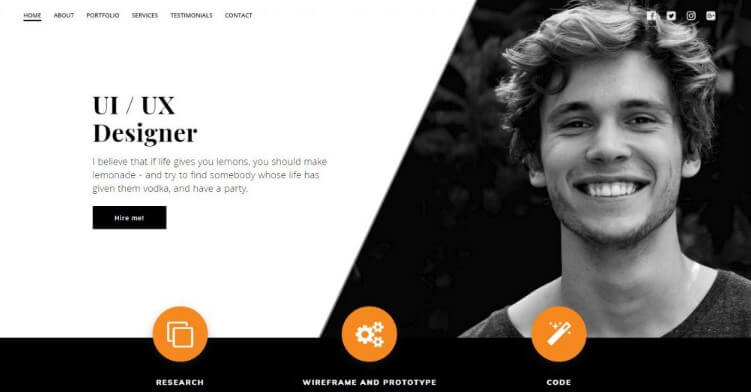
2. F-Shaped Layout
The F-shaped website layout design is also designed around the most commonly observed page scanning behavior among visitors. Visitors move across a text-heavy website in an F-letter pattern. This simply means the upper horizontal section of the page receives most of the concentration from the viewers. Then, the readers move downward in a vertical manner, with their focus still on the left side of the page.
An F-shaped web layout design is well-suited for content-heavy websites like blog pages. It is also appropriate for e-commerce and portfolio websites.
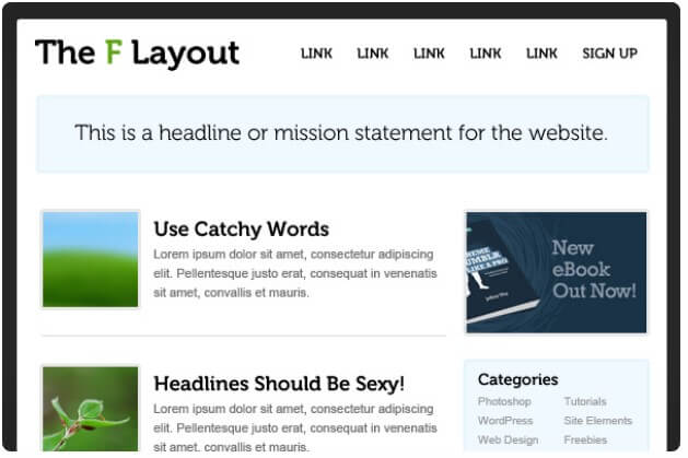
Source: Webdesign
Features of F-Shaped Layout Websites:
The F-shaped layout design features two different elements, including the following:
- The top of the page includes most of the information, including a headline, a subtitle, and featured images (as outlined in the above image). It also includes anchor text and a navigation menu to direct visitors toward other valuable sections of your webpage.
- The vertical line on the left-hand side of the webpage is designed to add appeal to the entire layout. You can add imagery or icons to make things interesting for your viewers.
3. Full-Screen Image Layout
If you intend to create a powerful and bold statement with your website like Netflix, go for the full-screen website layout design.
As the name implies, a full-screen webpage spreads the content upon a full-screen photo or image. Designing your website with an extra large visual right in the center of the page can give it an immersive design that is hard to ignore.
However, make sure the hero-size image strongly communicates the purpose of your business. Text sections, menu sections, and CTA are also included in the layout to support the image.
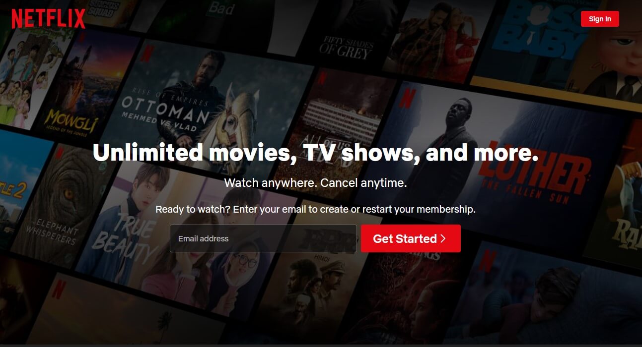
Source: Netflix
Features of Full-Screen Image Layout Websites
The dominant features of a full-screen web layout include the following:
- A high-quality, relevant visual that echoes the true image of your business. It is usually an image, an illustration, or a video.
- A strong header or a catchy slogan is there to support the striking image. Look how successfully Netflix has merged the living image with a short text in the above image.
- A Call-to-action is also adjusted in the upper right corner of the screen, giving users easy access to the website.
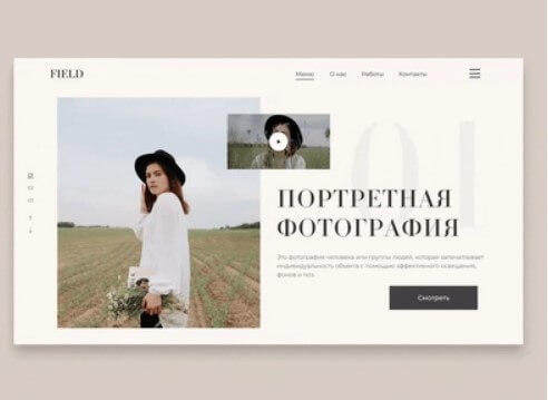
4. Split Screen Layout
The Split screen layout opens two different worlds for the visitor. By dividing the website neatly into two parts, it becomes possible for the website to convey a distinct idea or provide support for a single idea from two distinct perspectives. The objective is to promote prompt decision-making, fostering immediate engagement with the website.
The split screen layout is well-suited for websites that feature two distinct types of content or aim to balance written text and visuals. The above image showcases a split-screen layout where you can see the two sides of one business.
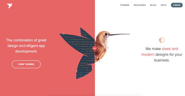
Source: Pinterest
Features of Split Screen Layout Websites
- The split screen has two parts divided by a perfectly symmetrical line.
- Website designers usually incorporate some motion into the images to make things interesting for the viewers.
- Large titles and huge fonts are used to highlight the true nature of the webpage without much straining.
5. Asymmetrical Layout
The asymmetrical web layout design is quite trendy and splits the website into two parts. However, like the former split screen style, the two parts aren't proportionate in terms of size and significance. This uneven weight distribution from one side to the other generates a sense of visual motion, rendering the overall design more dynamic.
These website layouts are flexible and can be effectively employed by a range of websites, such as businesses, freelancers, design agency online portfolios, and even e-commerce.
Source: Dribble
Features of Asymmetrical Layout Websites
- An asymmetrical design typically uses imbalance to emphasize a specific section of the webpage. These websites usually give more visual weight to certain elements, making them bigger, bolder and brighter.
6. Single Column Layout
The single-column layout is the most common, simple, yet famously used website layout design. This layout arranges all the information in one single vertical column.
These layouts are well-suited for long articles, blog posts, and research papers.
Source: Dribble
Features of Single Column Layout Websites
- Single-column layouts are easy to browse and navigate, making them user-friendly for mobile and desktop users. They also feature a "Back to Top” button to help users reach the top of the page without scrolling.
- The single-column layout is usually divided into line breaks, headers, and sub-headers to make the website even more interesting and grasping for the viewers. This simple trick makes the webpage easy to scan and also helps display long content in chronological order.
7. Magazine Layout
The magazine website layout got its inspiration from a printed newspaper. The magazine webpage layout employs a multi-column grid to create a visually captivating content hierarchy. The structure of this web layout allows you to prioritize certain headlines over other insignificant articles.
A magazine layout is an excellent option for websites with abundant content, such as news publications or blogs. However, this website does not adapt well to a mobile screen unless you adjust the elements wisely.
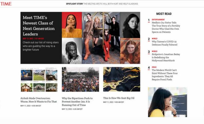
Source: Speckyboy
Features of Magazine Layout Websites
- The magazine web design usually contains columns that can be customized according to your needs. This layout is a fusion of three different elements – size, placement, and design. Using larger fonts, placing articles correctly, and adding images to certain articles are simple tricks to keep your visitors engaged.
- The magazine layout is also a fusion of other layout designs, especially the F-shaped layout, to make things interesting for the readers. The F-shaped layout merged with the magazine design allows you to organize a large amount of information into easily understandable chunks. It also gives your website a minimalistic look, keeping things clean for the readers.
8. Card Layout
The card layout is another widely used layout format you will find online. The structure includes multiple square or rectangular boxes. The boxes serve as containers of information and include text and images. All the cards or boxes have identical features and use similar fonts to treat every piece of information equally. The layout provides enough information to assist users in making an informed decision or encouraging them to click through for additional details.
Pinterest is a great example of a card-based website layout. The website utilizes the small boxes neatly and appropriately. The app arranges posts seamlessly, with varying sizes that suit the content type. The website's overall design compels visitors to visit the app repeatedly!
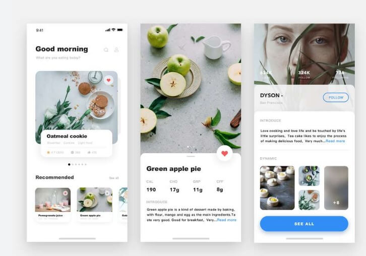
Source: Mockplus
Features of Card Layout Websites
- The card website layout is quite dynamic and fits all screen sizes.
- The website layout helps summarize a large amount of information into smaller sections.
- It further enhances user experience by enabling intuitive and user-friendly browsing, just like Pinterest.
9. Grid Layout
Easy browsing is one of the key elements of the best website layout and grid layout excels in it. A grid layout offers a set of horizontal and vertical grids to create a framework for content replacement. The framework then allows you to organize the information into different sections and modules. A website designed around a grid format looks well-balanced and eye-catching website.
Grid layouts are often used in websites that aim to present information in an organized and easily accessible way, such as news portals, online magazines, or portfolios. YouTube also follows a grid-style website layout.
Source: Colorlib
Features of Grid Layout
- The grid website layout allows you to organize information effortlessly into different sections and modules. This simple structure lets you display multiple interests on one page with an equal distribution of text, pictures, and videos.
- The webpage layout also uses a slider to enlarge the content on display, helping you retain readers for a longer.
- A grid webpage display is both mobile and desktop friendly as well.
10. Featured Image Website Layout
A contemporary way of designing your website is to incorporate a prominent image that represents the content of your webpage. The image functions as a focal point that captures the user's attention and piques their interest in the topic of the page. Additionally, the image serves as a visual anchor that conveys the meaning and essence of the webpage.
This website layout design is particularly suitable for people-centric websites such as freelancers and solopreneurs.
Source: Colibriwp
Features of Featured Image Website Layout
- Featured style websites look clean and are super easy to navigate. The navigation menu is neatly placed on the top of the page, whereas the image is the focal point of the webpage. They are also mobile-friendly, making them a good option for every business.
The 6 Best Landing Page Builders for High Conversion Websites
Part 3. Tips for Website Layout Design
Creating an aesthetically pleasing and user-friendly website layout is crucial for providing a good user experience and encouraging visitors to engage with your content. When designing your website layout, keep these tips in mind:
Choose an intuitive, clean layout
Avoid clutter and overwhelming visitors with too many design elements. Organize content logically into clear sections and make important actions, like contact forms or checkout buttons, easy to find. This simplifies navigation.
Ensure visual consistency
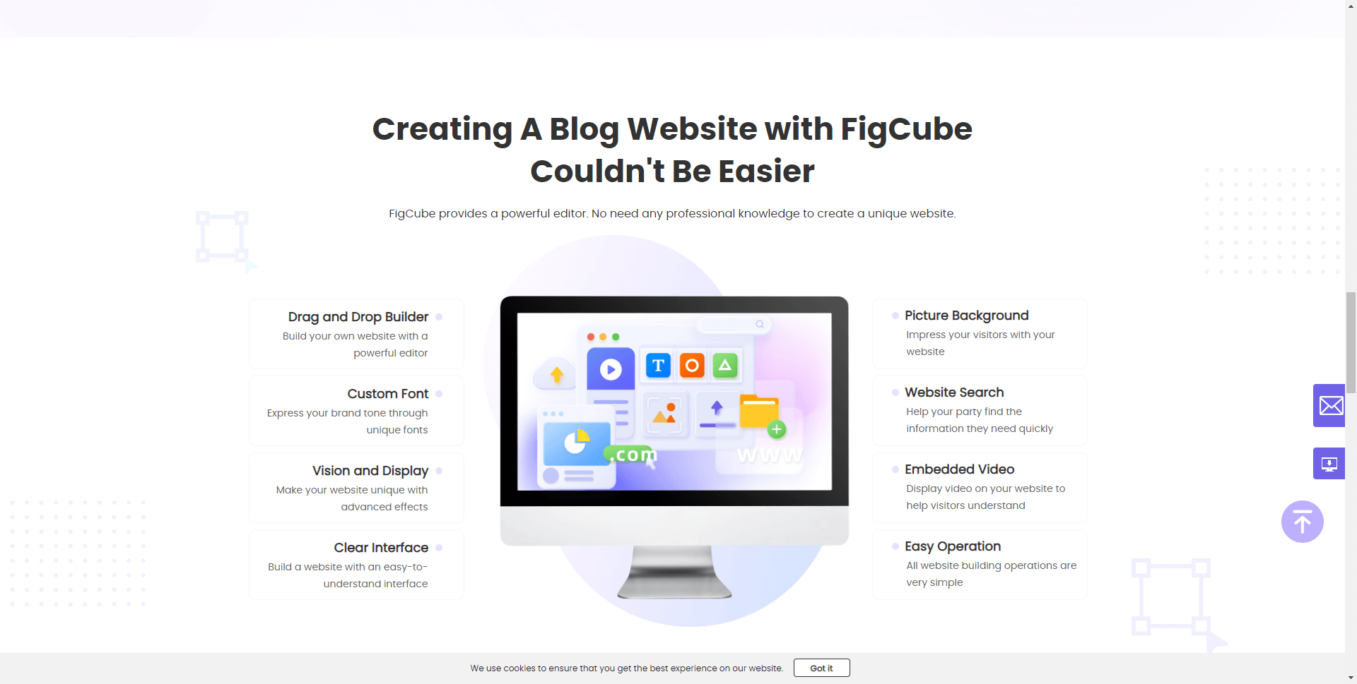
Maintain the same font, color scheme, and design elements throughout your site. This creates cohesion across pages. For example, the website builder FigCube provides professionally designed templates with consistent branding you can customize.
Optimize for mobile
With more web traffic coming from mobile devices, a mobile-friendly responsive design is essential. Test that site content is easy to read and navigate on smartphones and tablets, not just desktops. Figcube lets you preview site designs on different device sizes.
Use white space strategically
White space in the margins and between elements helps focus attention on your content. Be purposeful in how you balance white space and other components on the page.
Pay attention to page loading speeds
Quick loading times improve user experience and search engine optimization. Compress large files, enable caching, and optimize code to accelerate performance. Figcube optimizes sites for fast loading speeds.
Place important items strategically
Eye-tracking studies reveal people often scan pages in an F-shaped pattern. Use this to your advantage by placing vital content at natural focus points, like near the top and left sides of pages.
Test with users
Conduct usability testing to see how real people interact with your site. Watch for pain points and adjust your design to alleviate friction. Testing can prevent layout issues you may have overlooked.
Redesign when needed
Assess metrics like bounce rates and conversion data over time. If they worsen, it may be time for a site revamp. Figcube makes it easy to update your design if needed.
If you're looking for a website builder that makes it easy to create a polished, user-friendly site, try FigCube today.
Part 4. FAQs
1 What is the most popular homepage layout in 2023?
In 2023, a simple, uncluttered homepage layout with a hero image and clear call-to-actions is a popular and effective choice. This clean homepage layout draws attention to your key message and products/services.
2 What is an example of a simple website layout?
A simple website layout typically consists of a header with navigation, main content area, sidebars, and footer. It focuses on clean lines, ample white space, and minimal distractions to allow the content to shine. This type of simple website layout works well for many blogs and business sites.
3 How can I use CSS to create a website layout?
With CSS you can control the website layout by using flexbox, CSS grid, and other layout tools to arrange sections, columns, headers, footers, sidebars, etc. CSS gives you fine-grained control over spacing, sizing, positioning, and responsive behavior.
4 What HTML elements are used for website page layout?
Common HTML elements for structuring a website page layout include header, nav, main, article, section, aside, and footer. You wrap these semantic elements around their corresponding content areas to build the overall page.
5 What are some examples of creative website layouts?
Some examples of creative website layouts include asymmetrical designs, full-screen backgrounds, adaptive layouts, illustrative themes, split screens, parallax scrolling, and more. These sites go beyond basic layouts to create unique visual experiences.
6 How can I choose the best layout for my website?
Consider your brand, content types, audience, and goals when selecting a website layout. Opt for simplicity, focus on user needs, ensure mobile responsiveness, and test different layout options to determine what performs best. The optimal layout enhances the user experience.
7 What are the most modern website layout trends?
Current popular website layout trends include responsive fluid grids, flat and minimalist designs, full-screen video backgrounds, pop-ups and overlays, bold typography, mobile-first, and asymmetric or broken grid layouts.
8 What are the most modern website layout trends?
Current popular website layout trends include responsive fluid grids, flat and minimalist designs, full-screen video backgrounds, pop-ups and overlays, bold typography, mobile-first, and asymmetric or broken grid layouts.
9 Should my website layout be consistent on all pages?
Yes, you generally want a consistent website layout across pages to create a cohesive user experience. Maintain the navigation, branding, core styling, and general content structure. Consistency builds familiarity for visitors.
Conclusion
The website layout is an important aspect of web design that can greatly impact the user experience. We have discussed many layout designs, and each has its own way of effectively organizing content on a website. Each layout has its unique strengths and can be chosen based on the type of website, its content, and the user's needs.
While there is no one-size-fits-all solution, following the best practices for website layout can improve usability, engagement, and conversion rates.
(Click to rate this post)
Generally rated 4.8 (256 participated)
Rated successfully!
You have already rated this article, please do not repeat scoring!