


10 Best Website Homepage Design Examples for Inspiration
Category: Web Design

7 mins read
Your website homepage is the most important page on your entire website. It is the first impression visitors get of your business online. Designing an amazing homepage that sells requires an understanding of key elements from establishing a clear value proposition to including a prominent call-to-action. This article will explore what makes for good website homepage design. You will also see 10 examples of homepages that nail these elements with explanations of why they work. Use this as a guide and inspiration for creating or revamping a homepage that achieves results for your brand.
In this article:
Part 1. What Makes a Good Website Homepage Design
An effective homepage should capture attention and encourage people to explore the site further. There are several factors that influence the design of a homepage:
- A clear value proposition: Your homepage should convey your business's purpose or mission within the first few seconds of a visitor landing on your site. Use an attention-grabbing headline and visuals to communicate your key value proposition or service offer clearly. Keep messaging focused so people immediately understand what you do and the problems you solve.
- Visual impact: Striking visuals are important for engagement and interest. Use high-quality images, video, graphics or animation to enhance your value proposition and other homepage content. Visuals give visitors an idea of your brand personality and make the page more scannable. However, don't overcrowd the page which can decrease clarity.
- Simplicity and flow: A simple, clean layout with good flow between sections helps guide the visitor's eye down the page. Group related elements together and use heading to indicate topic changes. Have a clear page hierarchy and remove any unnecessary elements that cause clutter or distraction. Keep your primary call to action obvious as visitors should know what to do next.
- Trust indicators: Provide elements that build credibility and trust in your brand on the homepage. This could include customer reviews, media logos, awards, certifications or testimonials. But don't make these the main focus - your value proposition and content should still be prominent.
- Prominent CTA: Your primary call to action or CTA should be visible above the page fold to encourage conversion. The CTA could prompt visitors to sign up for a newsletter, schedule a demo or purchase. Keep your CTA highly visible by using contrasting colors.
- Skimmability: A well-designed homepage allows visitors to quickly skim and find important information. Using chunked content, meaningful subheadings, bullet points or numbered lists, the inverted pyramid approach when writing content and concise yet compelling paragraphs aid skimmability.
A homepage design that considers all these key elements - from value proposition to simplicity and calls to action - fosters an amazing user experience. Keep your visitors engaged, convey your brand message fast and clearly and move them along to other relevant pages. Test and optimize your homepage to maximize conversions and get the results you want.
Part 2. 10 Best Website Design Examples to Inspire You
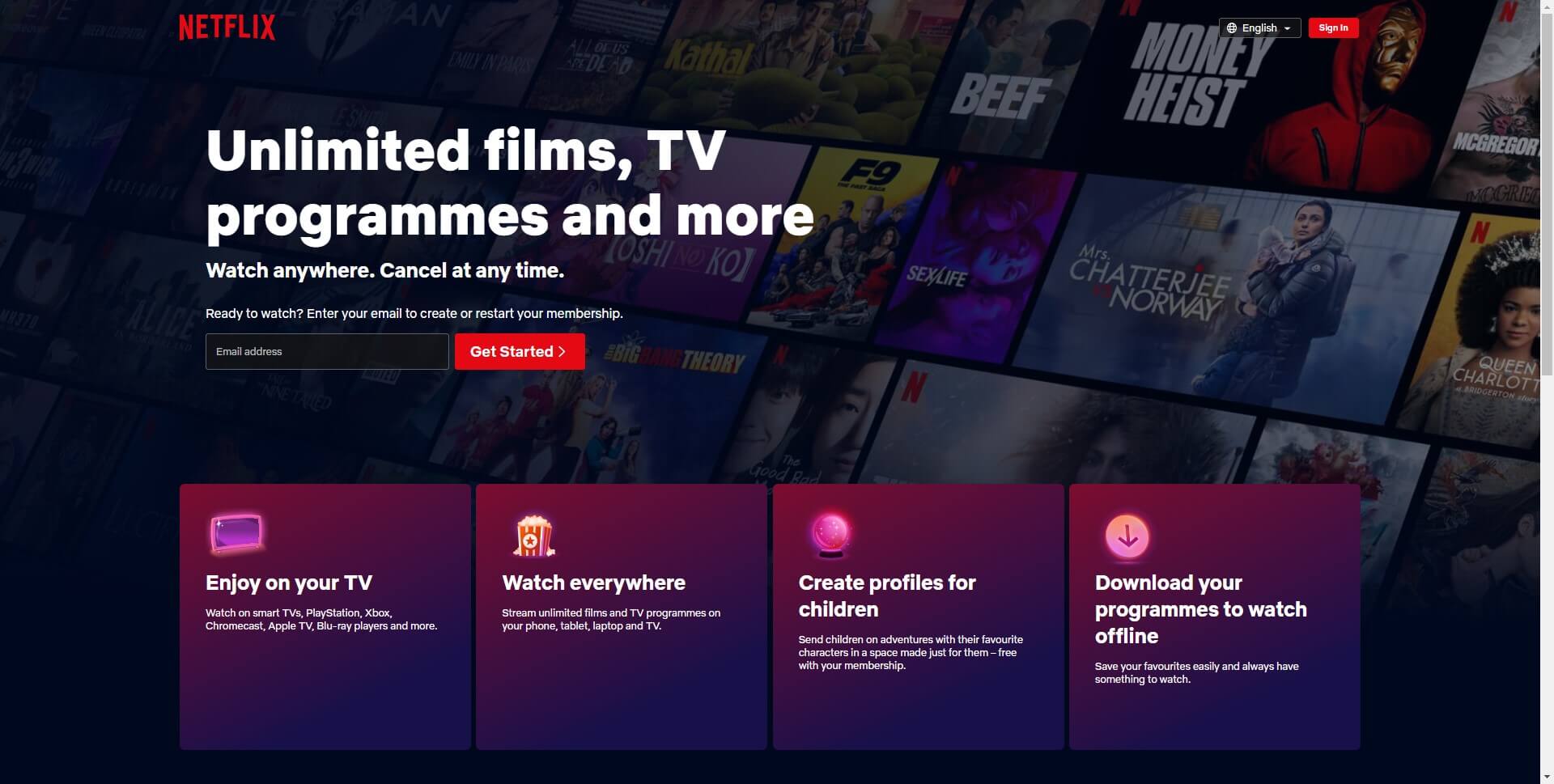
1. Netflix
Netflix is a subscription service for streaming TV shows and movies. Their homepage focuses on new and trending titles through large display visuals with minimal text. Viewers can easily browse and find content to add to their lists. The personalization and customization on Netflix's homepage keep things interesting for return visitors. It works because the primary goal is discovery and their model depends on viewers consuming and enjoying as much content as possible.
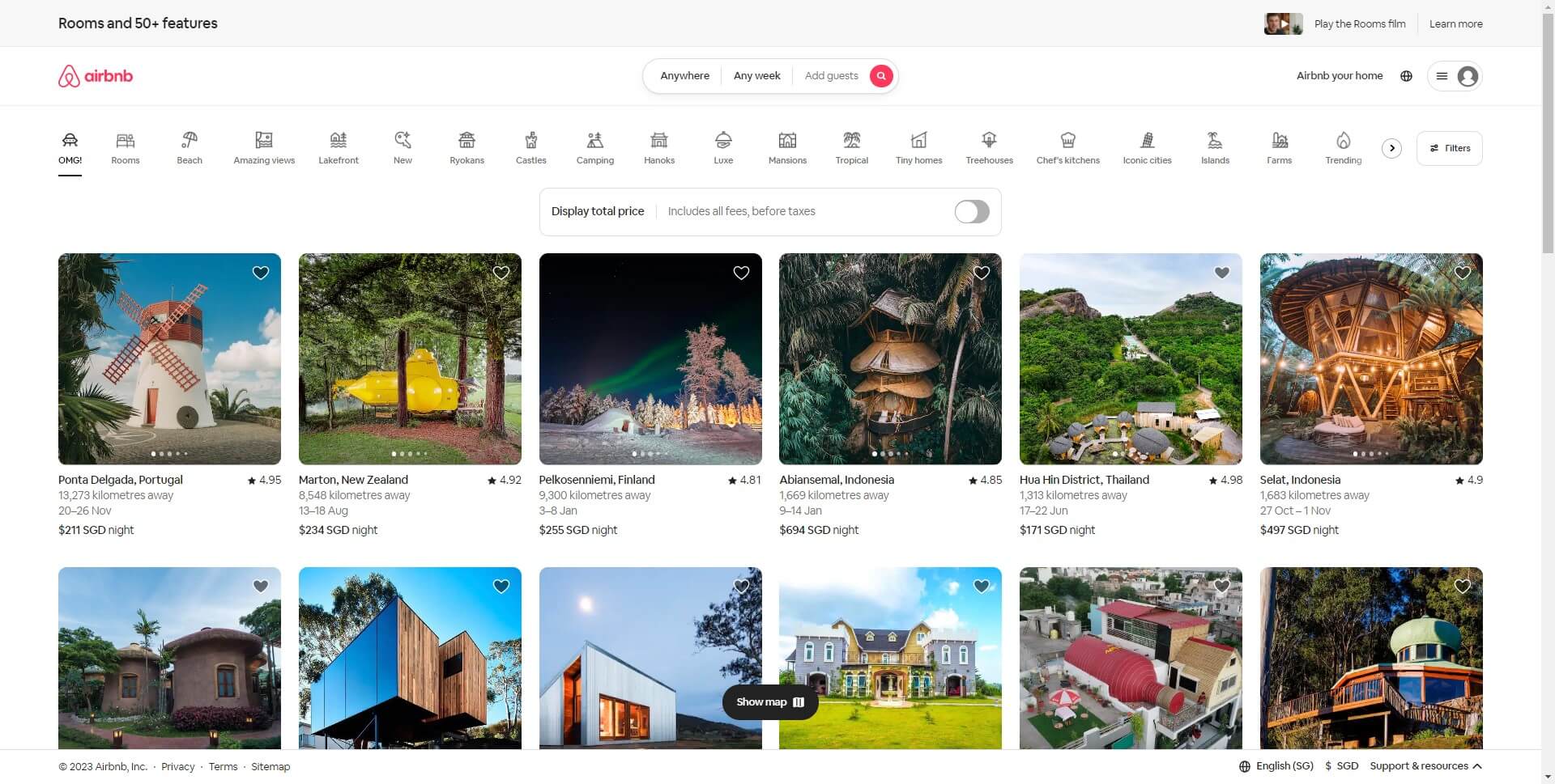
2. Airbnb
Airbnb is a global accommodation booking site. Their homepage makes you feel inspired to start traveling with vibrant images of unique places to stay and experiences to have around the world. Options to browse destinations, property types or collections are clearly visible with a smooth scrolling flow. The uncluttered layout, balanced use of white space and high-quality photography entice people to book their next trip. It works by evoking feelings of wanderlust and adventure while simplifying the search and booking process.
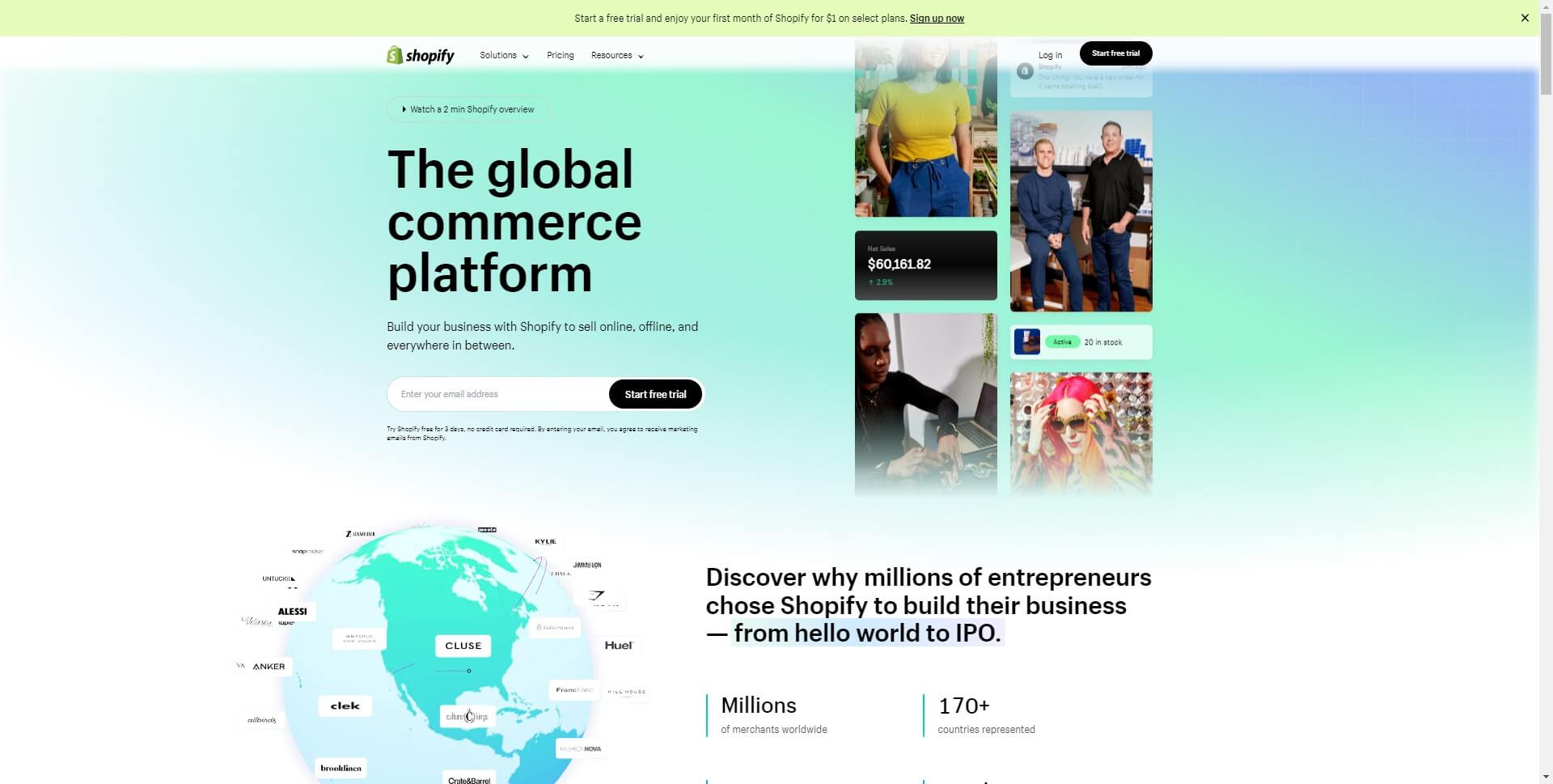
3. Shopify
As an ecommerce platform, Shopify's homepage is clean and enticing. Their bold slogan "Start, run and grow your business" center page communicates exactly what they offer. Viewers can start a free trial with additional info on features. It works because the message is clear and the design simple but compelling with links to key resources for those interested in launching an online store.
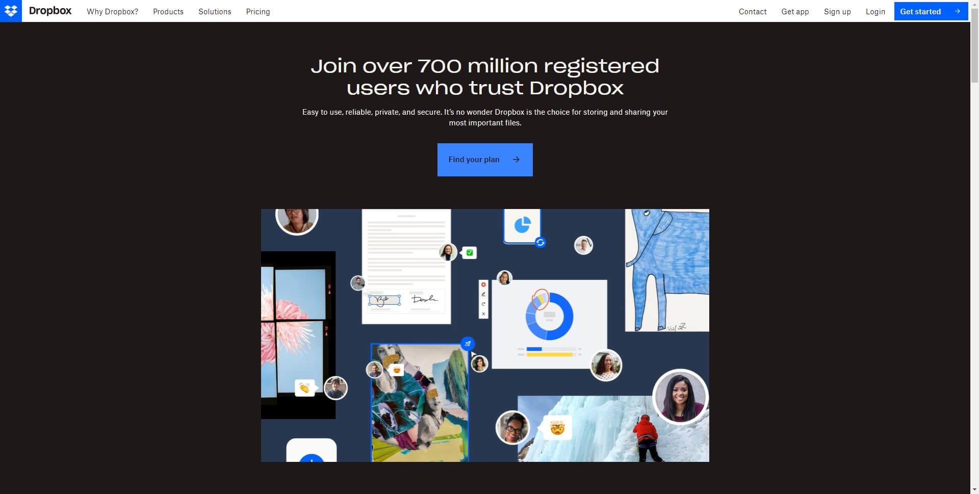
4. Dropbox
Dropbox offers a user-friendly file sharing service. Their homepage has a friendly style with an illustration and examples highlighting personal and business benefits. Quotes from publications provide social proof. The call to action to "Try Dropbox for free" is casually integrated with messaging focused on productivity, security and ease of use. It works due to the warmth, balanced sections outlining key features and the prominent, low-commitment call to action.
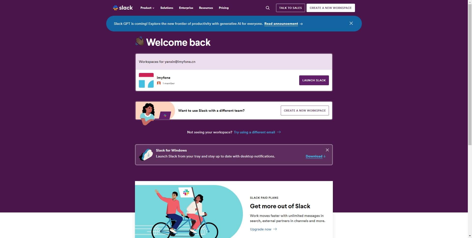
5. Slack
Slack provides a collaboration hub for teams to work together seamlessly. Their homepage generates excitement to improve productivity with color-coded illustrations and an animated hero graphic. Stats and associated logos exhibit social proof while compact content conveys Slack's usefulness for companies of any size. The header-only layout keeps navigation minimal, concentrating on the call to action. It works because the visuals, credibility indicators and enthusiastic copy convey Slack as an agile, innovative solution for efficient teamwork.
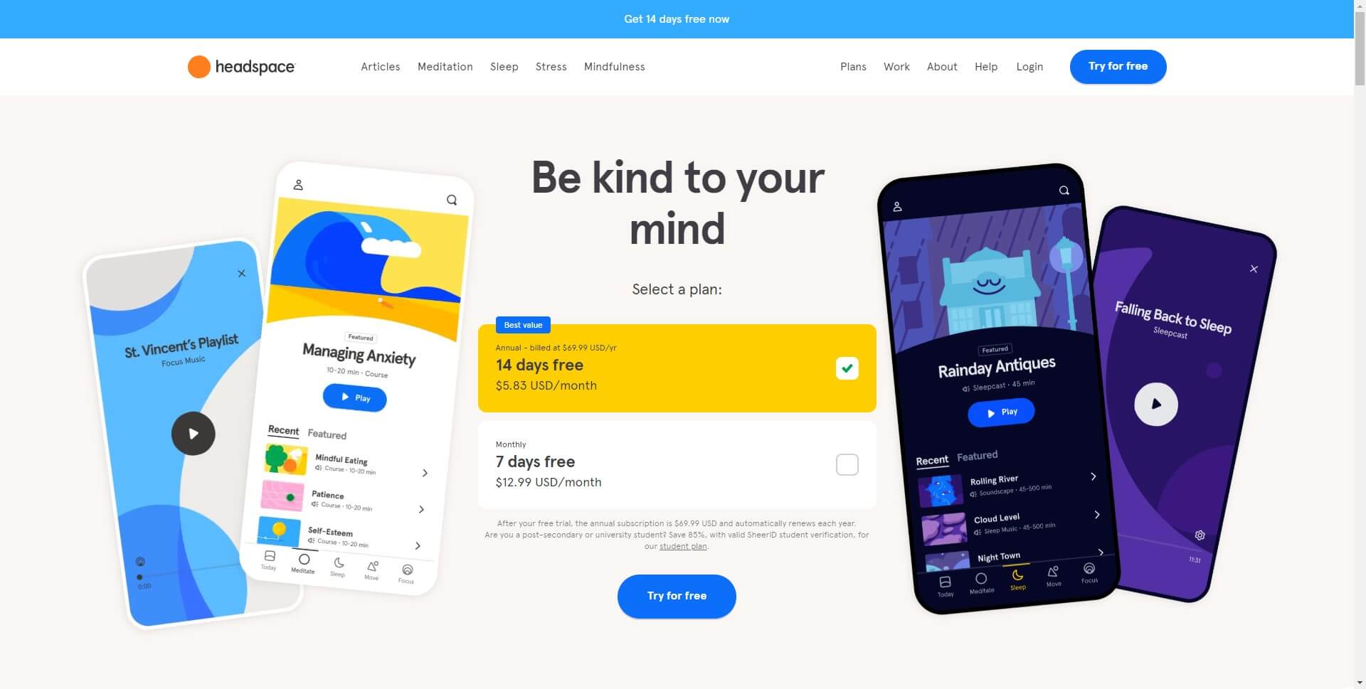
6. Headspace
Headspace is a mindfulness app providing guided meditation and calming soundscapes. Their homepage has an atmospheric, soothing style with abstract visuals, nature-based images and muted colors. Gentle text outlines how users can improve their day through the Headspace resources. Numerous testimonials provide authentic social proof. The overall tranquil and compassionate vibe reflects Headspace's brand and offering. It works by giving visitors a sense of comfort and support in an emotionally positive space.
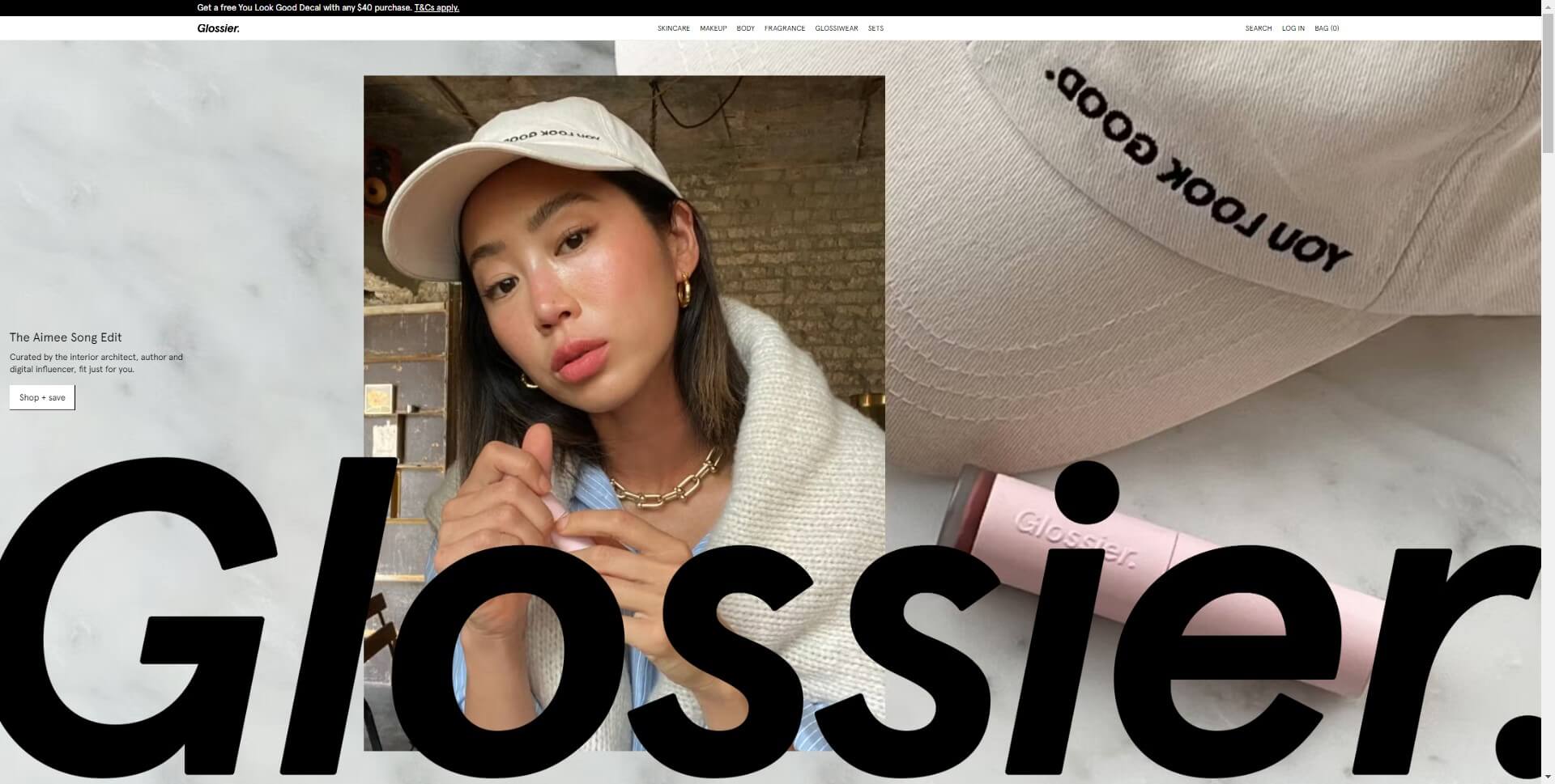
7. Glossier
Glossier is a millennial beauty brand selling makeup, skincare and wellness products. Their homepage has a youthful, playful look with product shots, lifestyle images, colors like pink and metallic and gifs or animations. Content focuses on new launches, beauty or fashion tips rather than hard product promotion. Sections flow together seamlessly inviting continuous scrolling. Shopping is subtly encouraged through "Check out what's new" and "Shop products" links. It works by embracing Glossier's fun, stylish brand personality and nurturing a dedicated customer community.
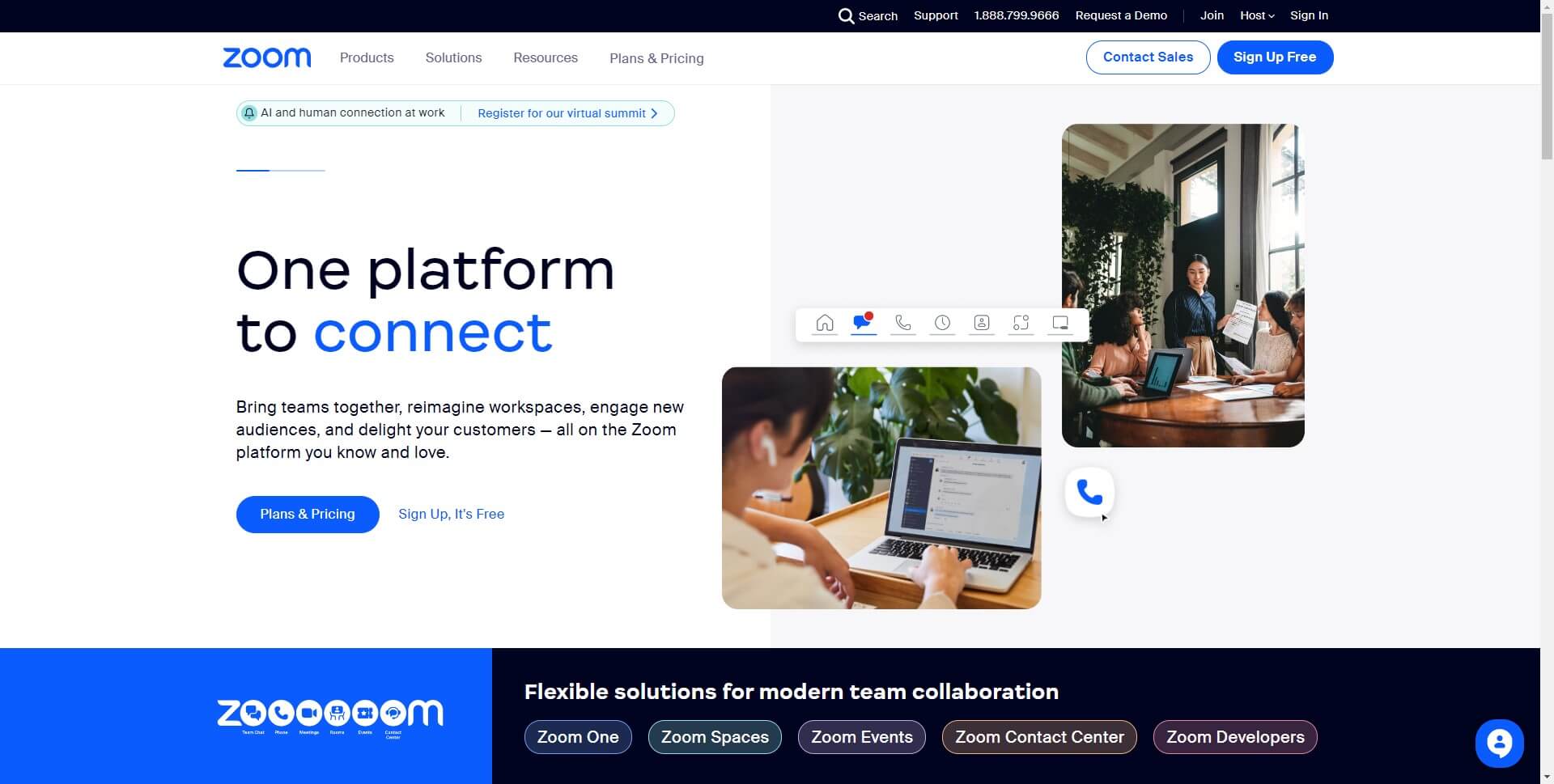
8. Zoom
Zoom offers a video communication platform to connect people through virtual meetings, video webinars and chat. Their homepage highlights the simplicity of using Zoom for work or personal life through minimalistic illustrations and messaging. Stats, customer logos and press mentions establish credibility while concise copy focuses on productivity, accessibility and ease of use regardless of tech savvy. A single call to action "Sign up, it's free!" encourages visitors to get started with the basic package. It works due to the straightforward yet personable brand style and by emphasizing how Zoom improves connections everywhere.
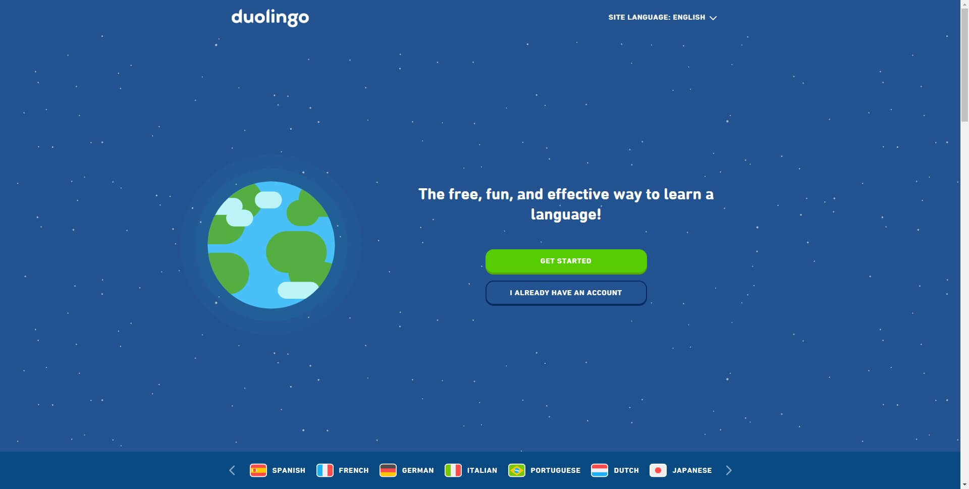
9. Duolingo
Duolingo provides a popular free language learning app. Their homepage playfully showcases how fun and quirky picking up another language can be. Colorful illustrations, graphics, video clips and a cartoon owl mascot named Duo catch interest. Copy featuring benefits for all ages and skill levels is written in a casual, lighthearted voice. It works by stimulating a sense of achievement and motivation in an entertaining way rather than tedious studying. Duolingo's brand personality is injected with creativity to inspire continuous learning.
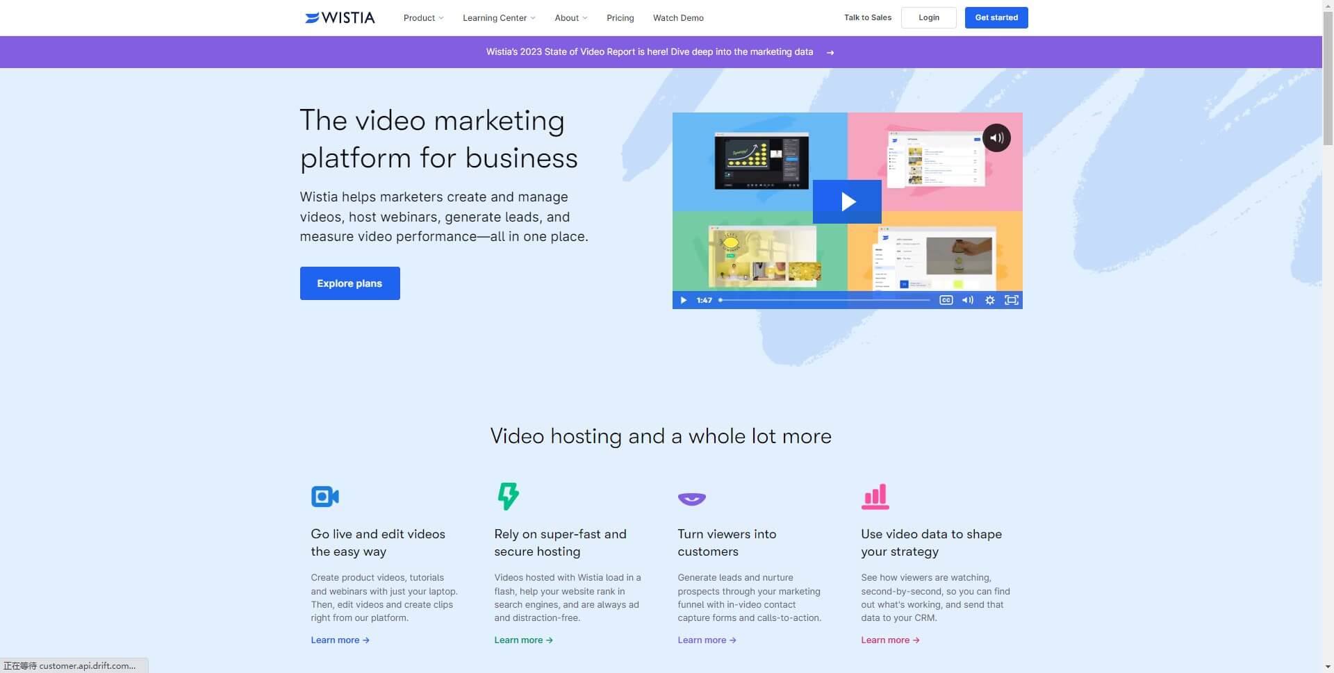
10. Wistia
Wistia offers video hosting and analytics for businesses. Their homepage incorporates footage from customer videos, gifs, illustrations and visual elements for connection. Sections titled “Your cat videos deserve a home too” or “Store your videos with the cloud people trust” show Wistia's humor and reliability. Stats and testimonials provide credibility. Vibrant colors and movement keep visitors scrolling to the call to action. It works through the dynamic visual style, social proof and quirky brand voice demonstrating Wistia as a knowledgeable yet approachable video partner.
In summary, these 10 examples highlight several elements of effective homepage design:
- A clear value proposition: Communicate what your business offers and who benefits fast. See Slack, Shopify or Headspace.
- Visual impact: Use quality images, video, graphics and color to capture interest. Examples are Glossier, Airbnb, Netflix or Duolingo.
- Simplicity: A minimal, uncluttered layout with good flow and visible page hierarchy. As with Dropbox, Zoom or Wistia.
- Social proof: Share stats, reviews, customer stories or media logos to build trust. Wistia, Slack, and Zoom do this well.
- Prominent CTA: Have a highly visible call to action, like "Start your free trial" or "Sign up now". Examples are Shopify, Slack or Dropbox.
- On-brand personality: Reflect your brand identity through visuals, content style or messaging. See Glossier, Duolingo, Headspace or Wistia's fun styles.
- Personalization: customized elements for logged-in users or based on preferences. Netflix is a prime example.
- Discovery: Make it easy to browse products, search or uncover new items of interest. Airbnb and Netflix nail this for travel and content.
The best homepages balance business goals with the needs and motivations of visitors. They convey a compelling brand message through creative UX design and optimize the path to conversion with clear CTAs. Effective homepage design should build a connection, foster community and make people feel understood.
When revamping or redesigning your homepage, analyze what establishes your competitors or industry leaders as successful. But don't copy them directly. Figure out what makes your brand unique and how your products or services improve lives then bring that story to life through interactive visual experiences. Stay on top of trends but integrate them in a way that feels true to your business vision.
Test and optimize to find the best solution because every audience is different. A homepage is never complete but with the right mindset and core principles as a guide, you can design one that meaningfully impacts visitors and achieves powerful business outcomes. Turn your homepage into a valuable channel for sharing your purpose, generating interest and sparking new relationships through customer-centric connection by design.
Conclusion
A well-designed homepage serves as your digital welcome mat. It greets visitors with a meaningful first impression and guides them to discover more. This article reviewed key elements for web homepage design success and 10 examples to inspire your own optimized design. Website homepage design is never complete, but with the right principles your digital entryway can become a valuable channel for sharing your story, generating brand excitement and building lifelong relationships by putting your visitors' experience first. Turn strangers into friends through a homepage worth remembering and they'll stay with you for the journey ahead.