


Brutalist Websites: A Guide to Designing for Functionality and Authenticity
Category: Web Design

8 mins read
When you think of a website design, I am sure what comes to mind is sleek, polished interfaces with stunning visuals and intuitive navigation. But did you know that there is a growing trend in web design that literary flips that idea on its head?
Well, there is, and it's referred to as brutalist websites! In this article, we are going to tell you everything that you need to know about brutalist websites – what they are, their origin, potential benefits and drawbacks, how to design them, plus examples of such websites.In this article:
Part 1. The Origin of Brutalism
The Origin of Brutalism
The origins of Brutalism can be traced back to the mid-20th century when a group of architects began to rebel against the prevailing design styles of the time. In the aftermath of World War II, many architects were looking for a new way and style of designing buildings that reflected the social and political realities of the post-war era. Brutalism then quickly spread throughout Europe and North America, and by the 1960s, it had become one of the dominant architectural styles of the era. It then fell out of favour in the decades that followed, but it was not until its influence could be seen in contemporary architecture and design, as well as in the world of web design through the emergence of Brutalist websites.
The Origin of Brutalist Web Design
With that said, the origin of Brutalist web design can be traced back to the mid-2010s, when a small group of designers began to experiment with a stripped-down, utilitarian aesthetic that emphasized the raw, unpolished functionality of the web. These designers were inspired by the principles of Brutalist architecture, which had long championed the use of raw, industrial materials and a minimalist design approach. Now, one of the earliest examples of brutalist designs was the brutalist websites that were created by designer Pascal Deville back in 2014. The site basically features a collection of websites that have embraced brutalist aesthetics, with large typography, simple layouts as well as limited colour palettes.
The emergence of Brutalist web design can be seen as a reaction against the prevailing trends of the time, which often emphasized flashy, over-designed interfaces that prioritized form over function. As a result, Brutalist web designers sought to come up with sites that were honest, easy to use and straightforward, without the distractions of unnecessary design elements. Since this time, Brutalist web design has gained a massive following among designers and developers who value simplicity, accessibility, and efficiency in their work. And as we have already mentioned above, it may not be for everyone, however, Brutalist web design has shown that there's still value in a stripped-down, utilitarian approach to web design, which emphasizes the core principles of the web.
Part 2. Top 10 Examples of Brutalist Web Design
Let's now take a look at some of the most popular examples of brutalist websites, plus their features;
1. 56 Digital
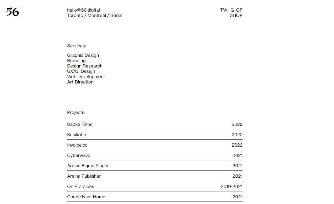
56 digital is basically a digital studio that is based in Toronto. When you look at the website, you will catch a glimpse of how simple it is. And even though you will find portfolio graphics tucked under collapsible project lists at the bottom of the list, there simply isn't much to look at. Some of its features include the following:
- No navigation as it only comes with some basic information regarding the company as well as their social media link.
- You will get almost everything from the homepage, with the only images found on the project list section.
2. A2-TYPE
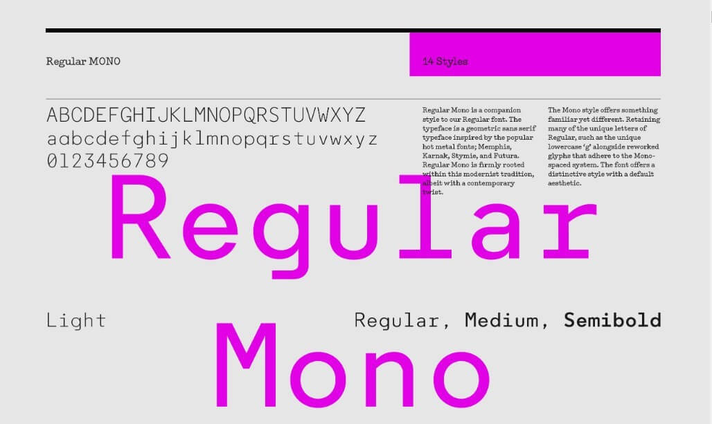
This is an independent font foundry. The majority of this site is what you would refer to as Brutalist in design. Basically, when you go into the website, you will find the open navigation at the top of the site, displaying all the pages without the need to engage further. Some of its features include;
- A solid magenta colour on the background, which makes it easier to see the content.
- Perfectly displayed fonts for easier reading.
- Doesn't feature any images as the website creators intended the visitor to see only the embedded fonts.
3. Alicia Keys
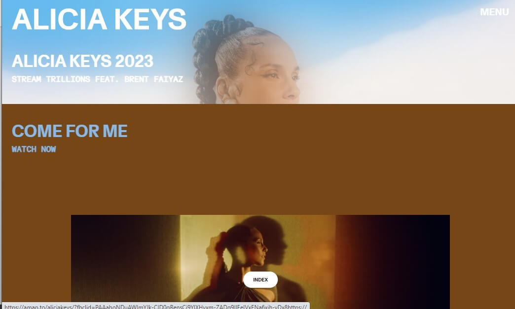
Yes, we are talking about the famous singer, songwriter, and actress. The thing about Alicia keys is that she has always made a point of making appearances at high-profile events without makeup, as she has always appreciated her physical appearance. With that said, it isn't that surprising that her website is also imbued with the same kind of raw and authentic quality. Some of her site's features include;
- It features raw images where they appear in their original size, shape and container
- The site just has a few words that accompany these images, which have been styled using a basic sans serif typography for easier reading.
4. Apelido & Apelido
This one is a quirky digital design studio that has an equally quirky website. When you look at the page, you will that there is no header. Only boxes containing text as well as a funky logo. Some of this site's features include;
- It features a few animations, an interactive video, and a guestbook in lieu of the traditional contact form.
- It is super easy to navigate and understand
5. Balenciaga
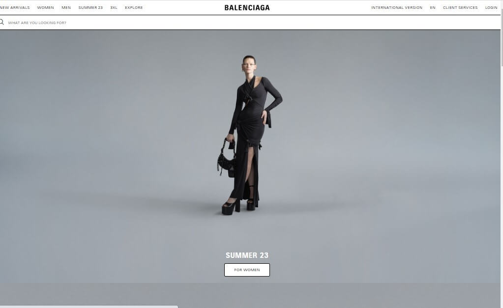
In the fashion industry, Balenciaga has long pushed people's buttons. It is literary taking fashion to the next level. A few years ago, it also took its website to the extreme as well, with regard to style. Here are some of its features include;
- The site's resembles a wireframe, which is more than a full-fledged website
- It features non-standard navigation and a lack of information hierarchy
6. Drudge report
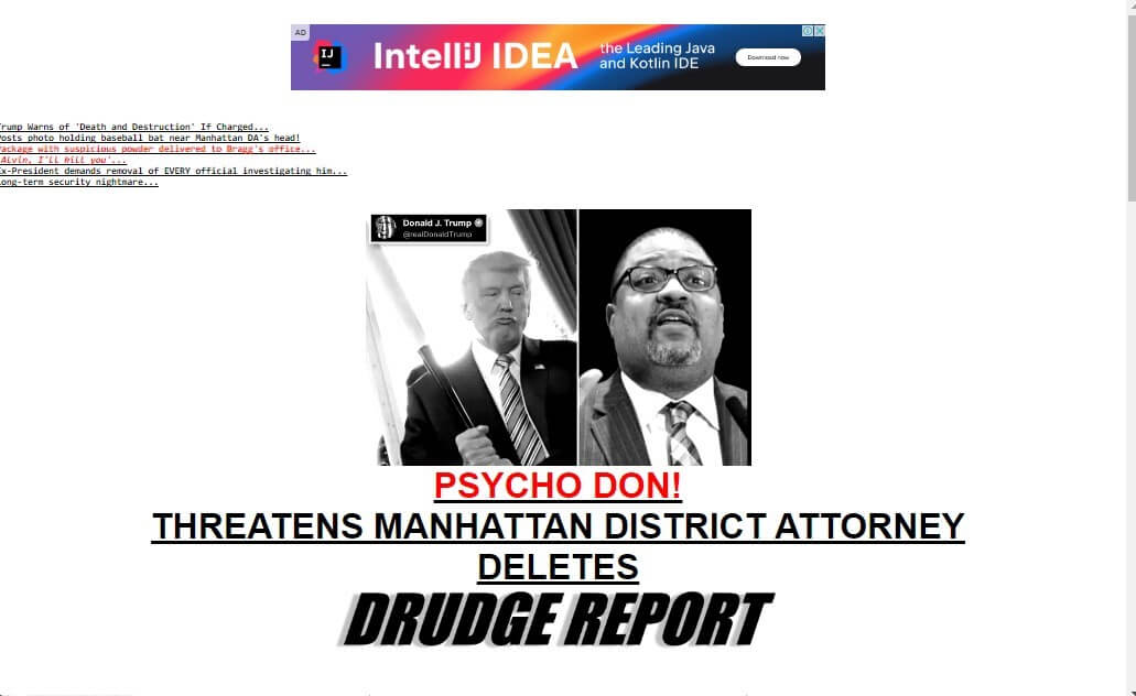
This one is a news aggregation website that has been around for quite some time, and it has managed to maintain a brutalist website design for this long. Some of its features include the following;
- A majority of the UI contains plain text links to news sources and articles
- It also features a basic black underlined style
- The links are haphazardly organized, just as you would expect on a brutalist website
7. MrBeast
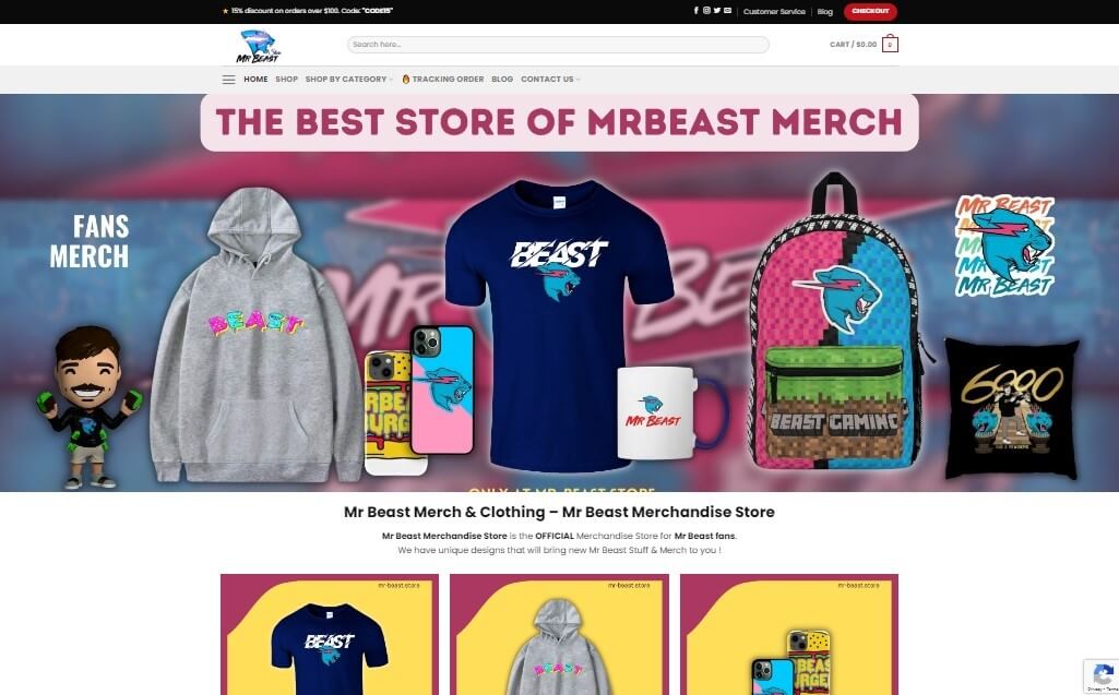
You probably know who Mr Beast is by now! And if you don't, just know that he is one of the biggest content creators or all-time on the web. He is popularly known for his numerous viral videos that usually involve cash giveaways. Now, Mr Beast also has an impressive online store that's largely brutalist in design. The website features;
- A retro aesthetic look featuring older style images, colours, fonts, layout, and typography.
- An old-school game in order to keep the visitors engaged even when they are bored.
8. Secession
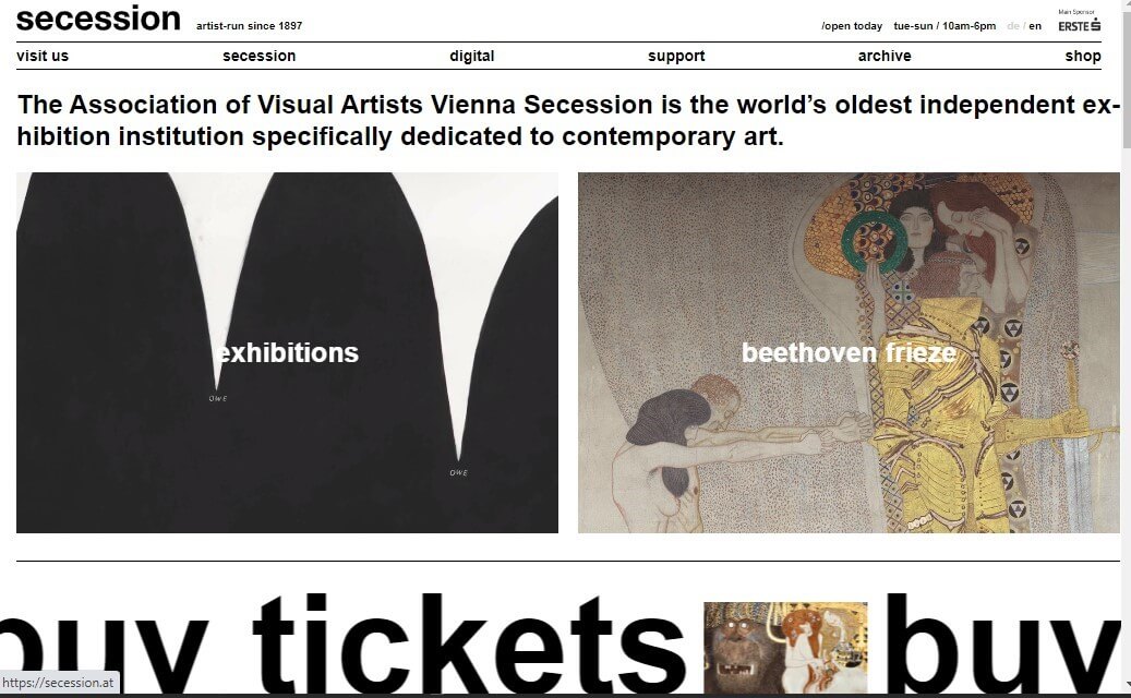
This particular website lives up to its purpose with a sleek and contemporary brutalist design, serving as Vienna's oldest contemporary art gallery's digital face. It is a pretty cool website that features the following;
- A text-centric style with both the scrolling and static text
- Features images done on simple cards that's make them look really appealing
9. Hot buro
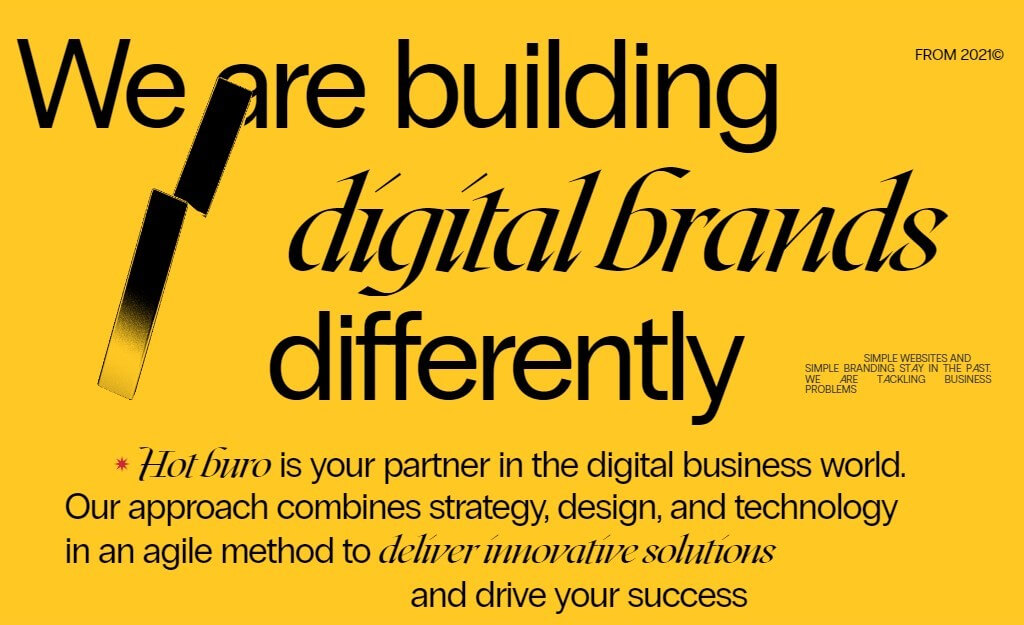
This is the other digital site that features a brutalist design, and it also looks really good. It features the following;
- An awesome typography that has been combined perfectly in the same elements, keeping everything looking quite cohesive.
- It also features alternative fonts so as to emphasize all the crucial phrases and words
- There are also 3D animations as well as buttons on its pages.
10. Studio Brot
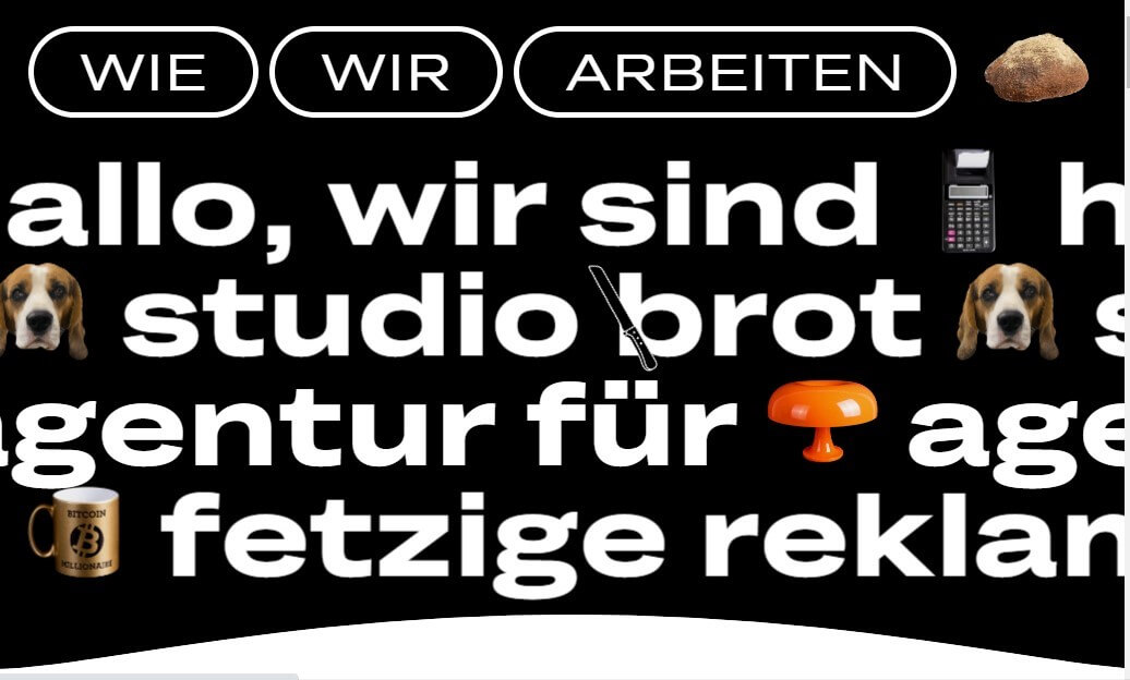
This website belongs to a German creative agency, and it combines minimalist and bare-bones construction that presents hints of fun and quirkiness that conveys tons of personality. It also features the following;
- Multiple captivating cursor effects and uses of motion that are aimed at maximizing user experience
Part 3. Pros & Cons of Brutalist Websites
Just like any other website designs out there, brutalist websites have both benefits and a few drawbacks. Here are some of the pros;
Pros of Brutalist Websites
Distinctive aesthetic – For starters, brutalist web design style is quite distinctive and memorable, needless to say, that it helps your website stand out from the crowd. If your business is after making a strong visual impression, then this is a feature that you would very much appreciate.
Focus on content – if there is something that really disrupts website visitors whenever they visit a site are the design elements. And as we mentioned, the brutalist design eliminates all the unnecessary design elements, and this, in turn, helps the visitors to emphasize more on the content and the information on the page. This is particularly effective when it comes to websites that are information-heavy, which can include news sites or academic journals
Fast loading times – the time it takes a website to load largely depends on all the design elements. A site with too many of them tends to be slower than one with fewer. With that said, brutalist websites tend to use minimal design elements and clean code, and they often have faster load times compared to other complex websites. And those with a slower internet connection or using mobile phones will find it quite convenient.
Lower development costs – since brutalist site design often relies on clean, minimal HTML, CSS, and JavaScript code, it is actually quite easy and faster to develop compared to other, more complex websites. And the faster and easier it is to create a website, to cheaper it is, and this is definitely a very appealing prospect for small businesses or start-ups with limited budgets.
Cons of Brutalist Websites
Limited design options – while on the one hand, the limited design aspect of brutalist websites can be beneficial – as we talked about above – it can also be restrictive, as it often relies on a limited colour palette and simple, utilitarian design elements. This is quite problematic, especially for designers who want to create a more visually complex or sophisticated website.
Potential usability issues – there are some users who would actually find it tough to use brutalist websites, especially those accustomed to more polished or visually stimulating designs. This can easily lead to frustration and a higher bounce rate.
Negative associations – it is very easy and common for brutalist websites to be associated with outdated or uninviting architecture, which could easily have a negative impact on the perception of your brand.
Limited interactivity – as these websites often prioritize function over form, there is usually a lack of interactive or visually interesting elements. This could mean less engagement with some users, which in turn means less business.
Top 10 Inspiring Examples of Minimalist Website Desig
Part 4. How to Make a Brutalist Website
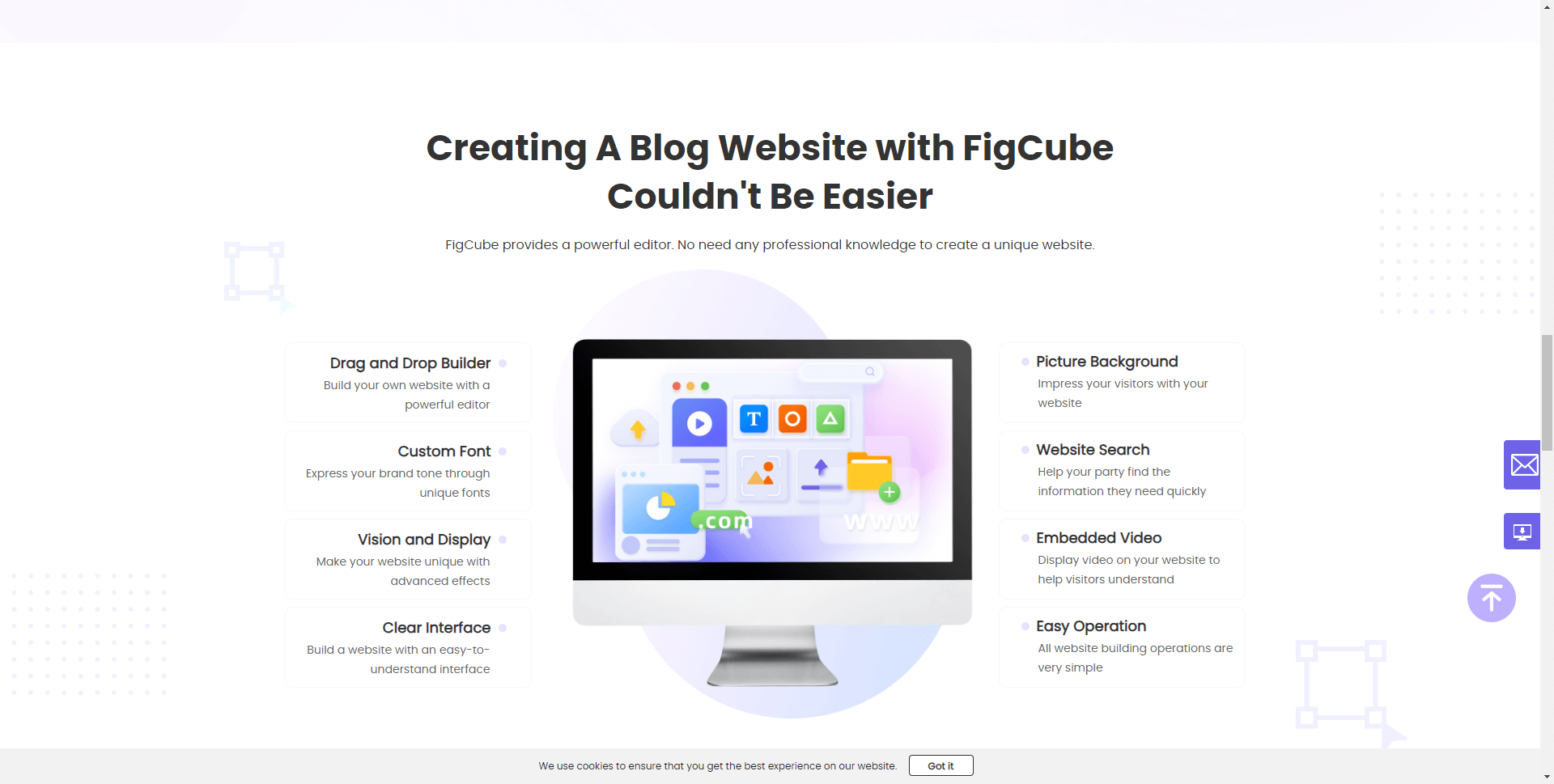
If you want to create a brutalist website and don't want to use the advanced coding skills needed, there are some website tools that are available that you can use. FigCube is a user-friendly website builder that makes it easy for anyone to create a professional brutalist website without coding.
Here are a few steps on how to use FigCube to create your brutalist hotel website:
Step 1 - Select a brutalist website template in FigCube – FigCube offers beautifully designed templates optimized for brutalist aesthetics, with a clean and minimalist layout.
Step 2 - Customize the design to fit your hotel brand – FigCube makes it easy to customize fonts, colors, images, and other elements to create a unique brutalist design aligned with your brand.
Step 3 - Select a limited color palette – FigCube has tools to choose the perfect minimalist color scheme for your brutalist hotel site.
Step 4 - Emphasize typography – With FigCube, you can select bold, striking fonts and adjust text styling to make the copy stand out on your brutalist site.
Step 5 - Focus on functionality over form – FigCube lets you build an easy to navigate site architecture focused on usability over aesthetics.
Step 6 - Preview on desktop and mobile – Easily review your brutalist website across devices and make tweaks with FigCube’s intuitive editor.Click here to learn more about mobile website design.
Lastly, FigCube makes it easy to incorporate raw, unpolished elements to give your site an authentic brutalist look. Try out FigCube today to effortlessly build your brutalist hotel website!
Part 5. FAQs
1 What are brutalist websites?
Brutalist websites feature very basic, raw, blocky designs with a focus on content over aesthetic. They often use a lot of raw concrete, bold colors, and harsh geometric shapes. Brutalist web design is a counter to the over-designed, flashy sites that have become commonplace.
2 What is the brutalist web design trend?
Brutalism is a web design trend that embraces hardcore functionalism and rejects design embellishments. Brutalist websites have a very raw, barebones aesthetic with little focus on visual appeal. The goal is to put the content front and center.
3 How can I create a brutalist website with Canva?
Canva has several brutalist web design templates that make it easy to create a brutalist site. Focus on using solid blocks of color, harsh geometric shapes, and a very basic, functional layout. Avoid using any unnecessary design elements that detract from the content.
4 What is neo brutalism web design?
Neo brutalism is a substyle of brutalist web design that incorporates slightly more visual interest than the very raw original brutalist style. For example, neo brutalist sites might use texture, shadows, or subtle gradients while still maintaining the hardcore functionalism of brutalist design.
5 How do I incorporate neo brutalist elements in my Canva website?
When designing a neo brutalist website with Canva, focus on adding subtle visual details like gradients, shadows, and texture while still keeping the overall brutalist aesthetic. For example, you could set a color gradient as the background or add a subtle shadow behind a text block. Just don't overdesign or make it too visually noisy.
Conclusion
As we conclude, if you are looking to create a site that emphasizes simplicity, functionality, and rawness, then the brutalist design would be a perfect choice.
By embracing all the key elements of brutalist web design, you will be able to create a site that stands out from the crowd and offers a distinctive user experience. So, why not go ahead and try this design and see how it can transform your online presence?
(Click to rate this post)
Generally rated 4.8 (256 participated)
Rated successfully!
You have already rated this article, please do not repeat scoring!