


10 Bad Website Design Examples - Mistakes to Avoid in 2023
Category: Web Design

8 mins read
Your website is more than just an introduction to your business. It's a powerful tool that can help you win over leads and draw in new customers. But if it isn't well-designed, it won't make the right impression, leaving potential customers with a bad taste and heading to your competitors instead.
That said, figuring out what constitutes bad website design can be tricky - after all, everyone has different tastes. That's why we've put together 10 examples of bad website designs, so you can learn from their mistakes and make sure your site stands out for all the right reasons.
In this article:
Part 1. Bad Examples of Web Design
Going beyond simply understanding the factors that lead to poor design, let's take a look at some real-world examples of popular websites with bad design that fail to deliver the user experience they should.
Even the most renowned sites sometimes struggle to produce an exceptional design experience. To give you a better idea of what you should avoid in web design, here are 10 websites that exemplify terrible design.
1. LINGsCARS
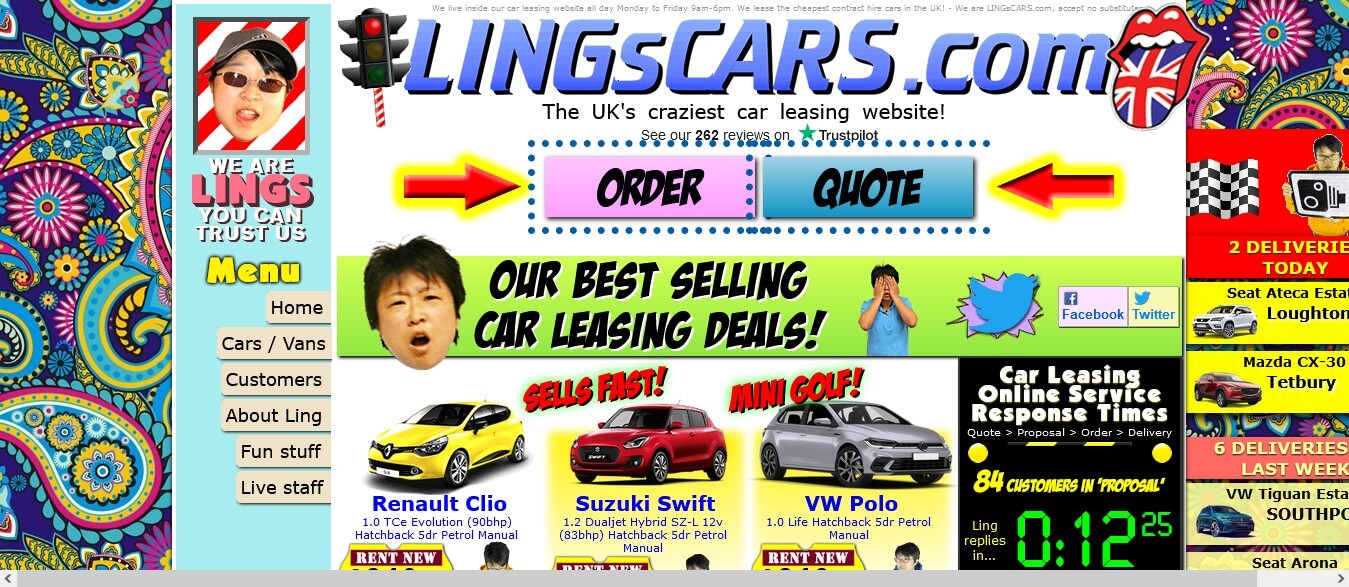
Trying to make sense of the website of this UK car rental business can be quite a struggle. Not only are there many moving components and a lack of user-friendly design but you may be left wondering what it all means. With so much clutter, it's hard to focus on finding the information that matters most.
What is Wrong:
From the moment you open the LINGsCARS website, it feels like a carnival of chaos. All sorts of flashing GIFs dance around with her bikes and cars - the color scheme is almost too vibrant and psychedelic. Navigation? Forget it - it's a mess! On top of that, it can be difficult to even choose a car; everything seems wrong at once.
What Can Be Improved?
Mrs. Ling's website needs a complete makeover; simplify the layout, focus the user experience, and get rid of any distracting elements. Enhance user-friendliness with a straightforward homepage menu and effective white space use. Tone down the color scheme and typeface, remove or reduce animations and prioritize making the car selection process intuitive.
2. Gates N Fences
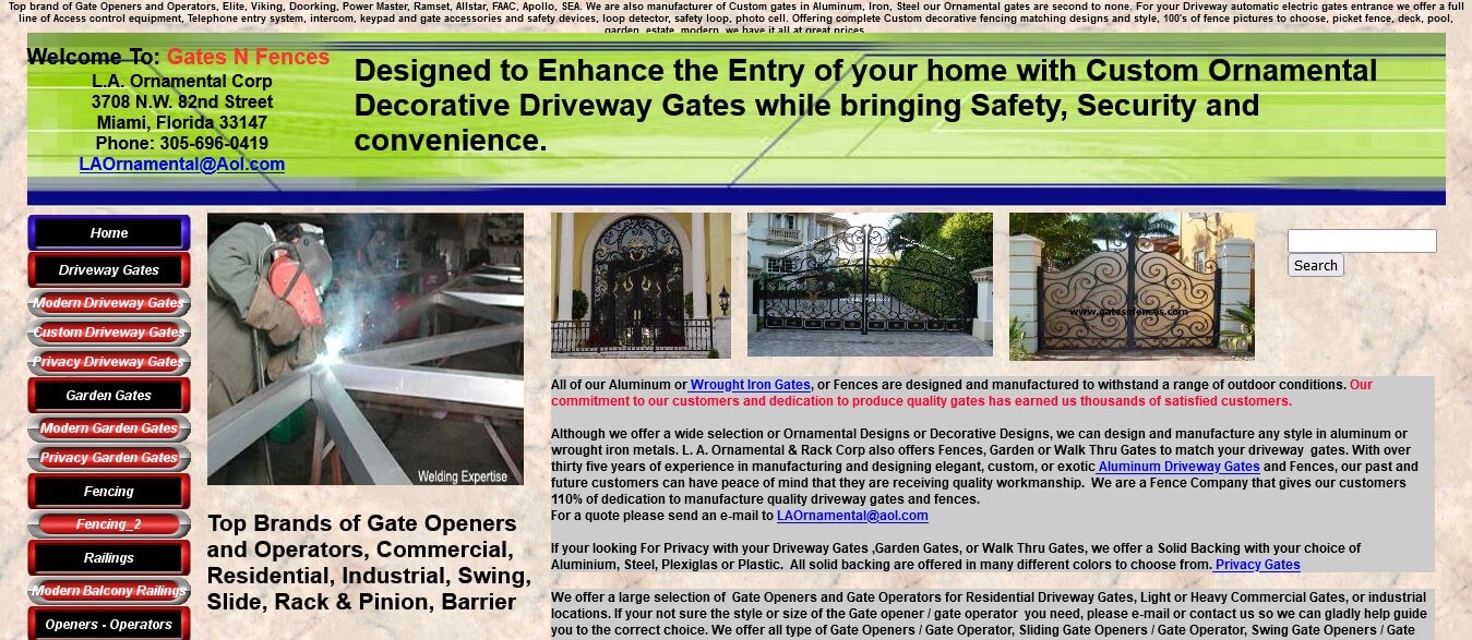
Upon visiting the Gates N Fences website, it's like you've gone back in time to 2004. When you look at the WayBack machine, it's clear that this site has remained nearly unchanged since then. This website is so far out-of-date that it's hard to believe they are still active in the business.
What is Wrong:
The website of Gates N Fences leaves much to be desired. Navigation is difficult, operations are unclear, colors don't match, images are small, and there's too much text on the page. The menu links are all skeuomorphic buttons, the background has a surface-like pattern, and the content feels dated. There is also no call to action and no visual hierarchy.
What Can Be Improved?
The top priority should be making the site mobile-friendly, with larger, higher-quality images and a simplified menu. Navigation should be prominent and eye-catching. Improve readability using a new color scheme, larger fonts, and modern design elements. Pay attention to the header/footer, Google maps integration, testimonials section, search feature, and proper user flow.
3. Zara
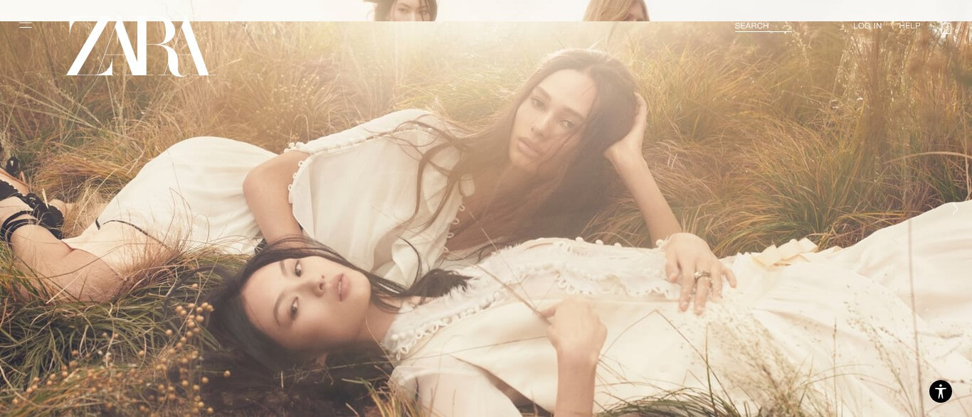
Zara is one of the biggest names in global retail, dominating both offline and online markets. However, their website fails to deliver the kind of experience you'd typically expect from such an industry leader - it's like leafing through a magazine. It's definitely not delivering what you'd expect from the world's largest retailer.
What is Wrong:
The navigation on the Zara website leaves something to be desired. Its hamburger menu is visually attractive, but it hides the primary and secondary navigation, making shopping more difficult for visitors. To make matters worse, there are no product recommendations, user reviews, or social media integration, and no clear CTA for customers. Even reading the text on the site can be hard due to poor formatting.
What Can Be Improved?
Navigation is key for good usability and success. Zara needs to step up their game with a horizontal navigation bar, drop-down menus, a fixed view for product display, and adding social media posts on the homepage. Product recommendations and reviews will also provide customers with a better understanding of what they're buying.
4. Wayfair
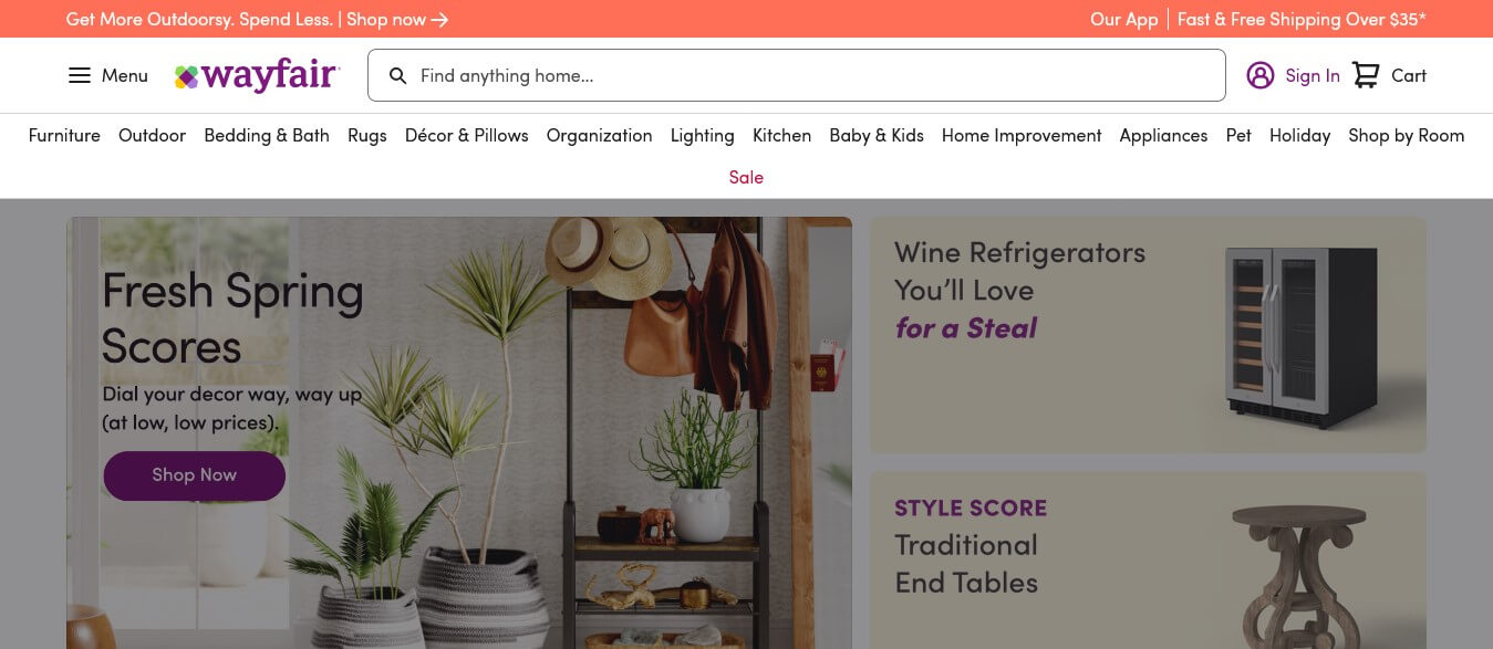
At a glance, Wayfair’s website may seem visually appealing and up-to-date - with seemingly no issues. However, there are still some areas of improvement. As an e-commerce business where only2.86% of website visits lead to purchases, every minor enhancement can make a substantial difference.
What is Wrong:
Wayfair's website fails to present a clear path for users to navigate, with elements of the same type (size, color, copy, and icons) and importance laid out in a confusing manner. This disorganization makes it difficult for users to figure out where to focus their attention. A strong visual hierarchy is essential in providing an intuitive shopping experience.
What Can Be Improved?
To improve the customer experience on Wayfair, a clear visual hierarchy is essential. By conducting user research, Wayfair can decide where to focus users' attention and what actions they want them to take. Additionally, improving the product images displayed on the website can aid in creating an intuitive shopping experience.
5. Arngren
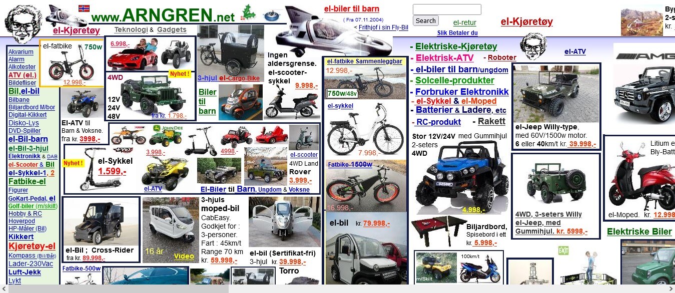
Exploring the Arngren website is like taking a long trip to the early days of the internet. Its lack of modern design elements, jumble of content and links, and disorganized layout make it difficult to understand or move around. It's clear that none of the accepted principles of web design were taken into account.
What is Wrong:
One would be better off asking what is good about the Arngren website, as it appears that literally, everything is wrong. The small font makes reading difficult, while the crowded layout fails to feature any negative space. The navigation menu is also complex, and unintuitive. In short, everything seems to be poorly organized and arranged in an unsuitable manner.
What Can Be Improved?
From selecting a suitable color palette to simplifying navigation, choosing the perfect typography, and making sure that call-to-actions are clear, there is a lot to do in order to make Arngren more user-friendly. Additionally, there should be an introduction regarding its location and the services it specializes in featured on the homepage.
6. Penny Juice
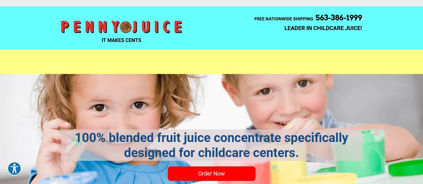
The Penny Juice is a well-known juice manufacturer, selling juices for childcare centers and has an estimated traffic of 30K-50K as per SimilarWeb. Despite the company's good reputation and high website traffic, their main online presence is lacking and unable to meet any goals. This serves as an example of just how bad UX websites can be. See how to do ux design by clicking here Benefits of UX Web Design: Success + Examples and Tips
What is Wrong:
Navigating the Penny Juice website isn't a smooth experience due to a lack of clear navigation - you can only reach other pages by scrolling down. Additionally, there's no consistent use of color, outdated stock visuals, and zero mobile optimization. Moreover, there isn't any call to action sections and the copy is poorly written.
What Can Be Improved?
Enhancing website navigation and usability requires a horizontal navigation bar, drop-down menus, improved visuals, organized content, mobile optimization, and clear call-to-action sections. The copy should be edited to ensure clarity and the layout should incorporate an eye-catching color scheme along with a well-chosen typeface and good visual hierarchy.
7. Blinkee
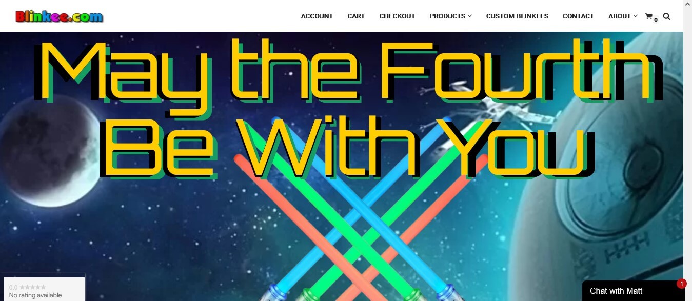
The website of this party supply store is decent, but it could be improved. The navigation is clear and the footer includes all the necessary links and info. Furthermore, the product photography looks good. However, there are some areas that could be tweaked further to make it even better.
What is Wrong:
The color scheme on the Blinkee website is not particularly clear and the fonts used are inconsistent. Furthermore, the logo of the brand looks outdated and the hero image is not very attention-grabbing. The website does not have a clear call-to-action, nor does it showcase New Arrivals, reviews or Promo Offers. The site tends to load slowly and sometimes doesn't load properly at all, with a distorted layout. The product overview pages are also not very user-friendly.
What Can Be Improved?
The website must have larger product images with a quick overview feature, multiple images per product and an updated look with modern colors and fonts. Visitors should be presented with new arrivals, promos and reviews to draw them in, as well as a clear call-to-action. Additionally, speed and stability of the site should be optimized for better user experience. Lastly, contact information and social media links should appear on the homepage.
8. Yale School of Art
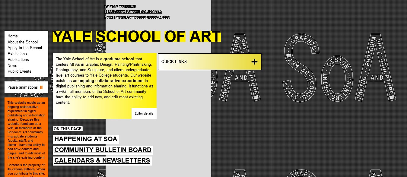
The Yale School of Art offers a great platform for students to receive MFA degrees in various areas of art, as well as undergraduate level courses in art. But those visiting the website for the first time may be surprised by its outdated landing page design, as if it was done by someone with only minimal HTML knowledge.
What is Wrong:
Exploring this website can be difficult when the navigation bar is hidden or misplaced. The quick links menu at the center of the page can seem out of place and disrupt the natural flow of web navigation. With no proper use of font sizes, colors, and borders, the site gives an outdated, and boring look overall. The background, header and footer are also poorly designed, making it difficult to find what you need quickly.
What Can Be Improved?
The website needs a complete refresh to enhance the user experience. Yale should highlight the homepage, news and events with high-quality visuals. Include a navigation bar at the top of the page with search functionality for easy browsing. Place all necessary links, articles and contact info in the footer. Create a modern design with bold fonts, colors and backgrounds.
9. New Century Chamber Orchestra
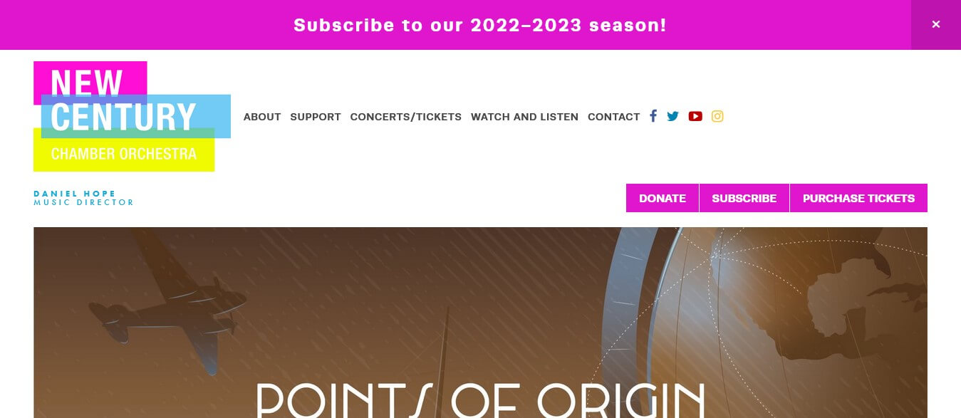
The New Century Chamber Orchestra has been delivering classical music with a new flair for three decades in the San Francisco Bay Area. Their website plays an important role in connecting them to their audience, yet there has been a lack of consistency in their branding across the site.
What is Wrong:
The New Century Chamber Orchestra website has a branding issue. The logo features three colors (pink, blue, yellow), but different parts of the site contain shades that do not complement this color scheme, leading to a lack of visual order. Furthermore, the messaging lacks clarity, making it difficult for any distinctive brand identity to emerge.
What Can Be Improved?
The best way for the New Century Chamber Orchestra to avoid issues of inconsistency and unintended choices is by utilizing a single color palette. Choosing a font style and size that are both consistent and easy to read will create a unified aesthetic, enabling the Orchestra to effectively communicate their message across all platforms.
10. Drain Right Now
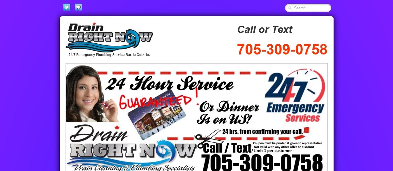
Drain Right Now is a local plumbing business in Barrie, Ontario and their website could be so much more. It's missing the modern design and features that are essential to draw new customers, and take their online presence up a notch. With some tweaks, they have the potential to truly stand out from the competition.
What is Wrong:
The website does not have a navigational menu at the top of its homepage, making it hard for visitors to quickly understand the company's services. Numerous essential links can be found in the footer of the website, but these are difficult to spot due to the small font size and lack of color contrast. Furthermore, instead of using a hierarchical structure with text and visuals, small banners are being used on the site.
What Can Be Improved?
For an optimal website user experience, the hero header should be used to guide visitors to the appropriate pages. There should be an easily accessible navigational menu at the top of each page, along with a well-structured text and visual hierarchy. The footer should also have greater visibility, with larger font size and higher contrast for better readability. In addition, call-to-actions, Google Maps integration, social media posts, customer reviews and high quality images of services should all be included.
Part 2. What Causes Bad Web Design
Whenever someone visits your website, they all share the same common expectation: to find what they're looking for quickly and easily.
A poorly designed website can make achieving these goals a struggle. Some of the most typical causes for a website being labelled as "poorly designed" include:
Complex Navigation
Website navigation is essential to quickly give users the information they need while providing a pleasant experience. Poor navigation can lead to confusion, frustration, and failure in finding what they are looking for. Clicking here to get tips on how to design your own website navigation.
Unattractive Visuals
Attention-hungry visuals can help make your website more attractive and engaging for visitors. Bad visuals will make users feel less secure and create a negative experience, giving them a bad impression of your website.
Unclear Calls to Action
Having a clear CTA can be like setting up a signpost for a user. It guides them toward taking the desired action. Without it, the user may be lost and unsure of the next steps to take, resulting in potential conversions being lost.
Not Mobile-Friendly Design
As the use of mobile devices increases, creating a website that looks good on smaller screens has become a must. Without this responsive design, your visitors will likely leave quickly and cause an increase in your bounce rate.
Mismatched Fonts
The use of mismatched fonts, as well as fancy ones, can make your website look unprofessional and reduce its readability. Staying consistent with one plain, simple font style throughout the whole website is key for a strong visual identity.
Poor Color Contrast
Some users may have a hard time reading content when there is low contrast between colors. That's why a ratio of 4.5:1 or higher is recommended, and usually the black text on a white background provides the clearest message.
Part 3. Tips to Avoid Bad Website Design & Error
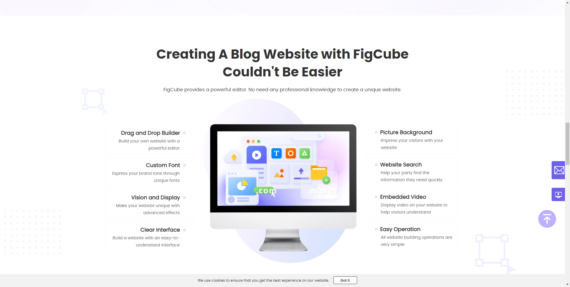
A bad website design can lead to a negative user experience, decreased traffic, and a lower conversion rate. To help you steer clear of these pitfalls, we have compiled a list of essential tips. And with FigCube, our powerful website builder, you can achieve a top-notch website design effortlessly. Here's how FigCube can assist you in creating a stunning website while avoiding common mistakes:
Take Advantage of Professional Support Services:
FigCube offers professional support services where you can continuously optimize your website for free organic search traffic. Our expert team can guide you through the process, ensuring that your website is well-designed and error-free.
Utilize Professional SEO Services:
To improve your website's ranking and exposure in search engines, FigCube povides professional search engine optimization services. We understand the importancer of SEO in driving organic traffic to your site and can help you implement effective strategies to boost your visibility.
Enjoy an Easy-to-Use Editor:
With FigCube's easy-to-use editor, creating and modifying website content becomes a breeze. You don't need to be a coding expert or have any technical skills. Our intuitive editor empowers you to make changes effortlessly, ensuring that your website always reflects your latest updates and offerings.
Explore a Range of Rich Website Templates:
FigCube offers a wide selection of professionally designed website templates. This variety allows you to choose the template that best suits your needs, ensuring that your website has a visually appealing and cohesive design. With FigCube, you can create a unique online presence that captures your brand's essence.
Personalize Your Domain Name:
To enhance your brand and create a memorable online identity, FigCube enables you to customize your website's domain name. This customization adds a professional touch and increases the personalization of your website. Choose a domain name that aligns with your brand and resonates with your target audience. Here are more tips to help you choose a suitable domain name: The Ultimate Guide: How to Choose the Best Domain Name for Your Website
Ensure Secure Web Hosting:
FigCube provides secure and reliable web hosting services. A secure server is essential to protect your website and user information from potential threats. Rest assured that with FigCube, your website will operate smoothly, offering visitors a safe browsing experience.
Facilitate Multi-Account Management:
If you have multiple team members collaborating on your website, FigCube's multi-account management feature simplifies the process. With this functionality, you can grant access to different individuals, allowing them to work together seamlessly. This streamlines your workflow, improves efficiency, and ensures a consistent website design.
Conclusion
No one wants to make a bad website design, but it can happen. To mitigate the chances of a poor design and enhance the user experience, it's important to know what causes bad website design, as well as what to look out for.
By studying the 10 bad website examples we've featured here and understanding how and why they failed, you'll be well-prepared to create a better website in the future.
We want to hear from you - share with us which website design mistakes surprised you the most, and what tips have you taken away from them.
(Click to rate this post)
Generally rated 5 (256 participated)
Rated successfully!
You have already rated this article, please do not repeat scoring!