


Top 10 Inspiring Examples of Minimalist Website Desig
Category: Web Design

6 mins read
Minimalist web design is the perfect blend of usability and aesthetics, where the mantra 'less is more' applies. Given the increased attention to user experience (UX), more web designers are turning to minimalistic designs to reduce complexity, speed up loading times and focus on user interaction.
In this article, we will explore what makes minimalist web design so effective, identify the types of websites that work best with this style of design, and showcase some inspiring examples to learn from. Follow along for an in-depth look at the best minimalist website examples.
In this article:
Part 1. What is a Minimalist Website
The goal of a website with a minimalistic design is to ensure users have an intuitive and distraction-free experience on the site. Through the use of consistent spacing, bold colors, ample white space, and simple typography, these websites offer an organized, clean look that makes it easy to navigate quickly.
The focus on minimalism also encourages visitors to take their time exploring the content without being overwhelmed by excessive visual elements or unnecessary clutter. By creating an environment that is both visually pleasing and easy to use, minimalism helps to enhance engagement levels, improve conversions and boost user satisfaction.
Part 2. What Websites are Minimalist Designs Generally Suitable for
The minimalist design offers many advantages when it comes to website design. They provide a more simple and visually appealing look, as well as improved user interactions and navigation. However, minimalist design is not suitable for all types of websites - so which ones should consider it?
Well, websites that aim to be simple and straightforward in the way they present information can really benefit from a minimalist design. Such sites could include portfolios, personal sites, business websites, blogs, e-commerce stores, fashion and beauty outlets, as well as lifestyle and travel-related websites.
These types of websites work best with minimalist design because they don't really require a lot of visuals, elements, or animations to convey their message. They can easily draw attention to the important things by focusing on a few key elements without cluttering up the design.
Part 3. 10 Samples of Minimalist Website Design
Just knowing what a minimalist website isn't enough - you need to see some real-life examples of these sites in action. That's why we've compiled the best minimalist websites around, each with unique features that make them stand out.
Let's check them out:
1. True Harvest Farms

This Central Texas-based hydroponic leafy greens farm has an effective and minimalist website design. The homepage features a soft black background with a big flower motif in the bottom left corner. At the top, is the company's logo on the left side and a hamburger menu on the right for easy navigation. A footer appears at the bottom with cookie policy, privacy policy options, social media icons, and copyright text. At the centre of it all is the main headline with a horizontal list of chefs – click each to reveal their own page along with an image featuring slight hover overlay effects.
Standout Features:
- Hover effects on images
- Sufficient color contrast
- Hidden hamburger menu
- Clear & stylish typography
- Consistent background design
2. Kim Dero
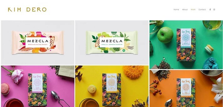
Kim Dero's portfolio website is a shining example of how minimalism in website design can be both welcoming and captivating. The homepage features a single, beautiful image of fresh fruits. The logo and essential page links can be seen in the header, and the footer displays small icons for social media accounts and a sharing option. The white background, along with a neat gallery grid setup, is used to showcase Kim's work. Each image has a subtle hover effect that's pleasing to the eye. Built with Pixpa website builder, the site is a testament to the phrase less is more.
Standout Features:
- Lightweight design
- Ample whitespace
- Gallery grid structure
- High-quality images
- Zero distractions
3. Philip House
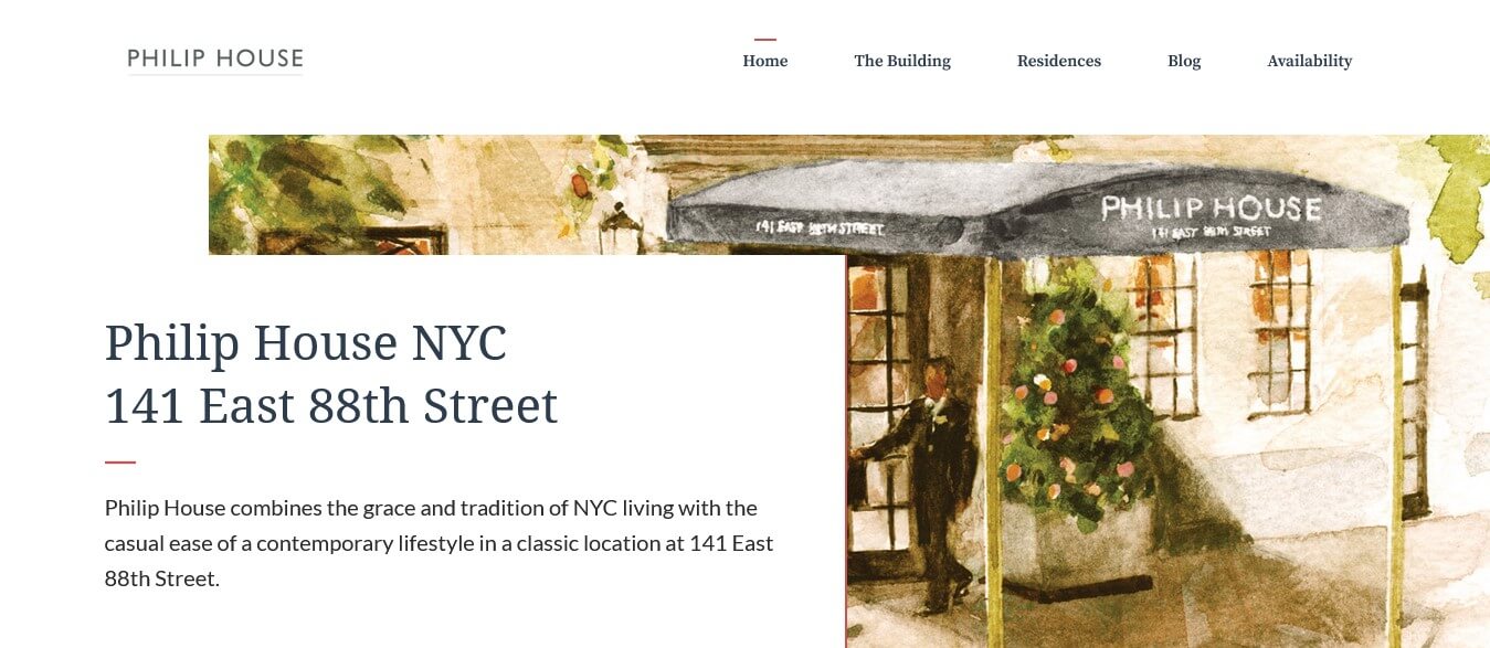
This luxury condo chain has a website design that's both sleek and sophisticated. On the front page, you'll see a beautiful drawing of the building alongside some text highlighting the company's location and purpose. The overall design uses minimalist elements like quotes, gorgeous photography, and plenty of negative space to give it a professional and high-end look. The color scheme is simple yet refined, with limited text to keep things clutter-free. Even the header and footer have a minimalist feel with only essential links and contact information.
Standout Features:
- Responsive web design
- Soft, cool color scheme
- Beautiful photography
- Clutter-free site layout
- Simple header & footer
4. Studio Nido
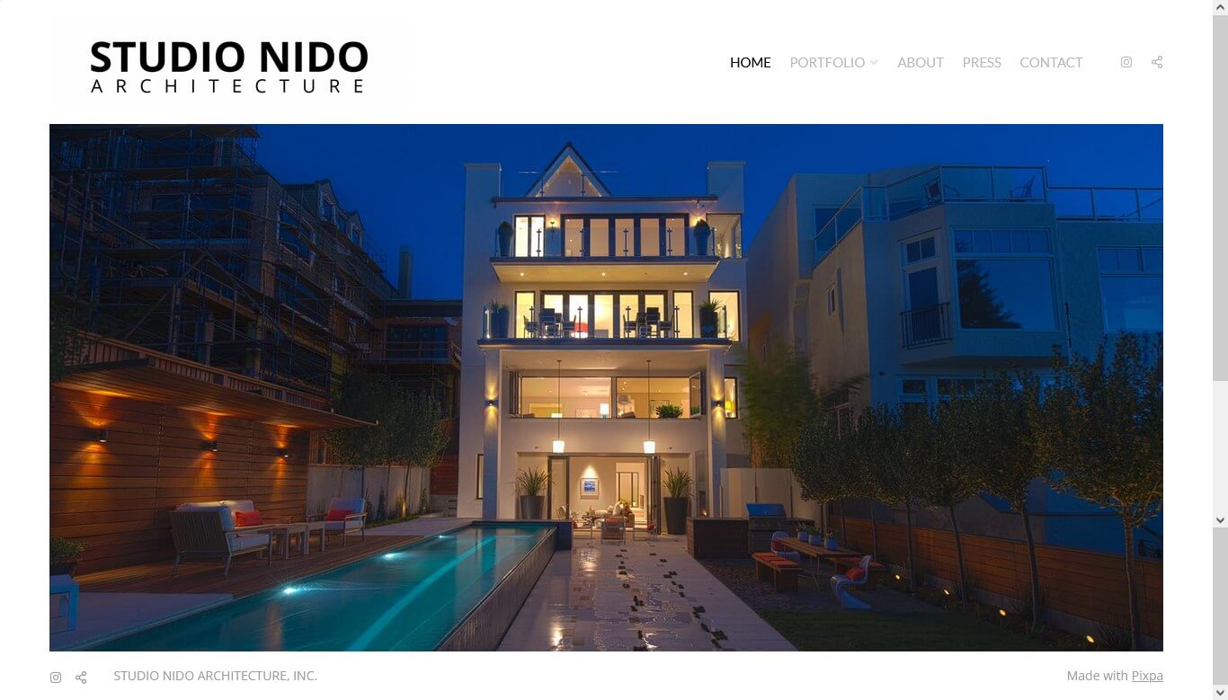
Studio Nido is an impressive architect's website that features a minimalistic yet modern design. As you land on the homepage, you're greeted with a beautiful slideshow showcasing the company's best work, and with no need to scroll down or read through the text. It's created with Pixpa, giving it a similar look to Kim Dero's website with a header containing a logo and menu options, and social media icons in the footer. The portfolio section is worth checking out, featuring high-quality images of their projects without any distracting text or clutter.
Standout Features:
- Concise messaging
- Attractive slideshow
- Essential menu links
- High-quality images
- Simple text logo
5. Paravel
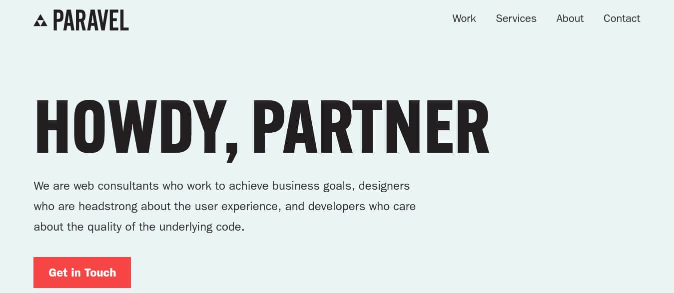
Paravel is a web consultancy company with a pretty unique style. Their own site is a great example of what they can do - it's simple and clean, with a mostly white and black color scheme. It's really minimalistic but still manages to get its message across well. They don't have a footer, but instead, there's a section where you can get in touch with them. And If you're interested in viewing examples of their work, they have multiple case studies showcased on their homepage in a z-shaped pattern.
Standout Features:
- Clear visual hierarchy
- Easily navigable menu
- Bold & simplistic design
- Neatly designed footer
- Zig-zag case study layout
6. Benny Cuppini
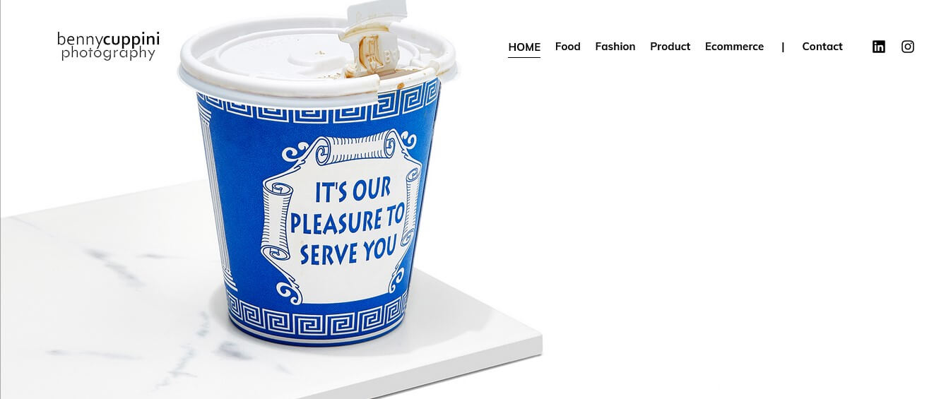
Benny's portfolio website offers a glimpse into his expertise in product and food photography. Visitors are greeted with beautifully stunning slideshows on the homepage, which perfectly showcase the work he has done in the past. With the logo and navigation menu placed at the top, the footer links only contain his social media profiles. This website primarily emphasizes visual communication, enabling Benny's stunning work to speak for itself.
Standout Features:
- Homepage is text-free
- Eye-catching slideshow
- Clear navigation menu
- Stunning photography
- Uncomplicated design
7. Studio Steve
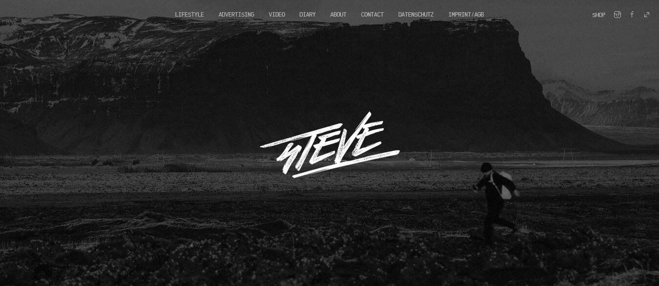
Studio Steve has nailed simplicity in their superb photography portfolio website. Unlike many others, this site’s distinct beauty lies in its uncomplicated full-image header design; there’s absolutely no need for any scrolling. The custom-designed, centre-placement, grayscale logo is a perfect focal point, while the transparent navigation menu at the top consists of the same color. There is no footer, but you won't miss it. The website has a dark theme, with high-quality image slideshows playing in the background.
Standout Features:
- Bold full-image header
- Perfectly centred logo
- Transparent navigation
- Striking dark theme
- There's no footer
8. Ascent Decisions
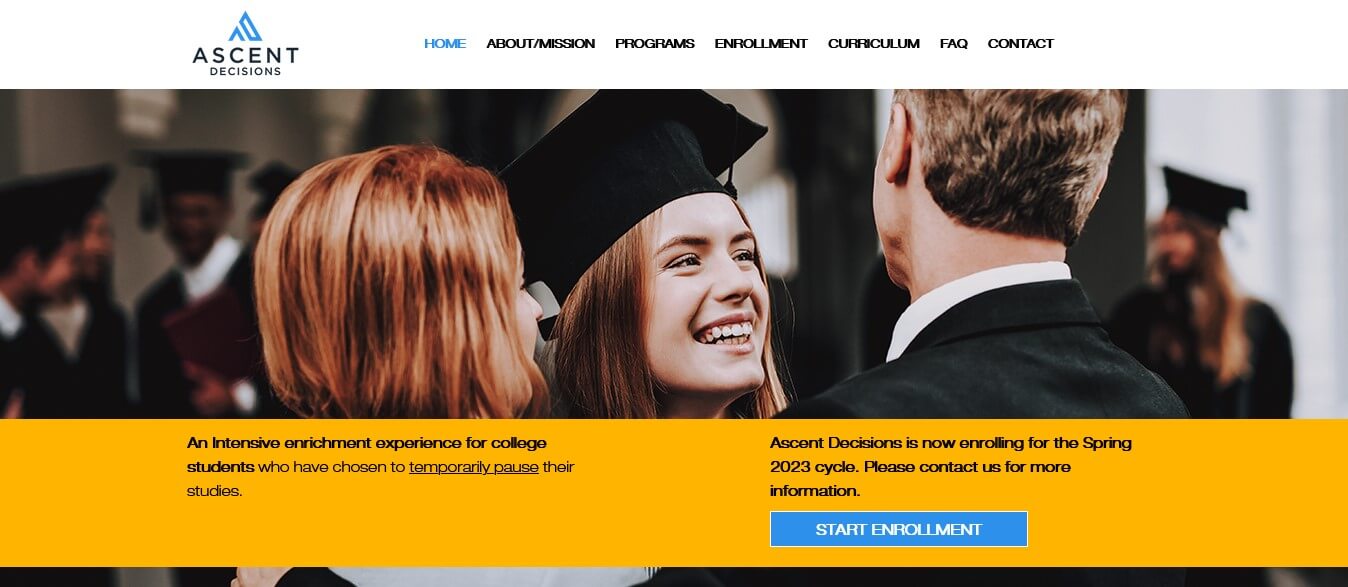
The website of Ascent Decisions looks professional, neat, and minimalist with bold colors and high-resolution visuals. The website is visually appealing with smart use of whitespace and slight animations, which makes it more engaging. The homepage is divided into sections giving clear information about the services and value proposition of the company. The user-friendly design also includes a fixed navigation menu, offering easy access to pages and a beautifully designed footer that contains detailed information.
Standout Features:
- Sticky navigation bar
- Elegant footer design
- Smart whitespace use
- Animated scrolling effect
- Effective use of colors
9. Mowellens
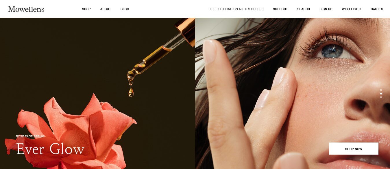
Mowellens offers a shopping experience that's more than just eCommerce. With its calming, engaging, and sleek layout, navigating the platform is a unique and visually pleasing experience. The base colors of black and white with high-quality images make it easy for users to find the product they want from their homepage. Each product has an individual image slider on the homepage that displays its name and has a CTA button leading to its product page.
Standout Features:
- Calming color scheme applied
- Creative scrolling animations
- Premium, exclusive images
- Product slides featured at top
- Clear CTA buttons on every slide
10. Nordica Photography
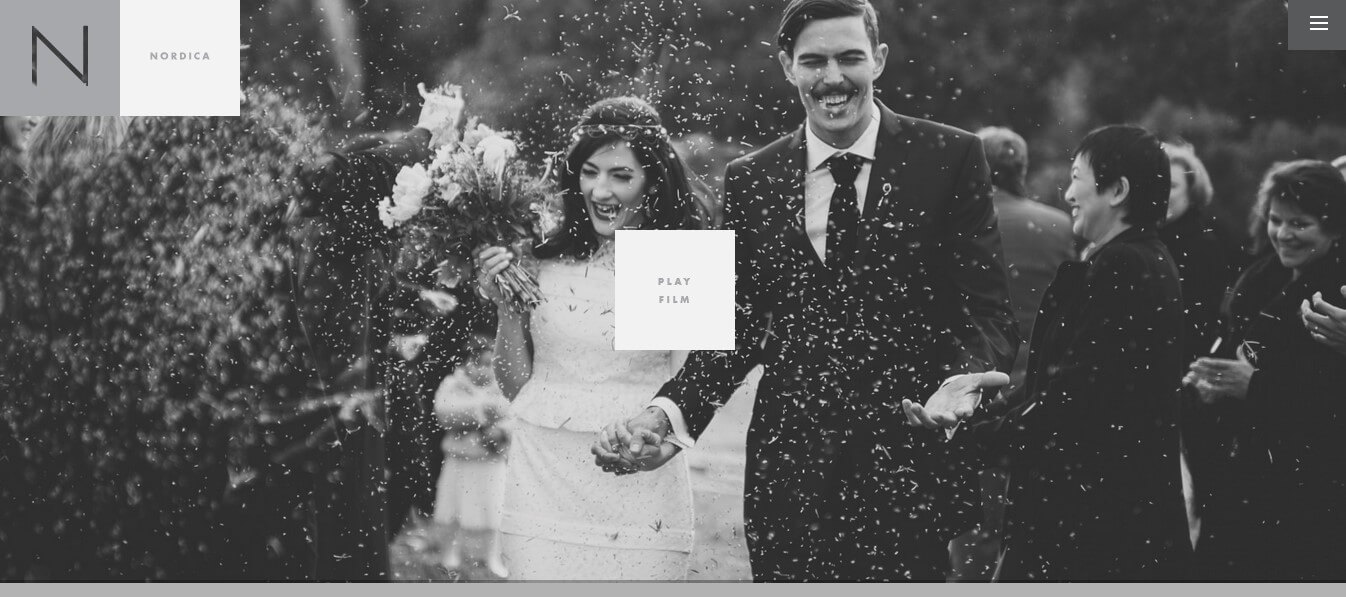
Here's another example of a minimalist photography portfolio site that we absolutely love. You'll immediately notice the stunning black and white wedding photo on the homepage, along with the company's logo and navigation menu at the top. There's even a "Play Film" button on the homepage that will showcase a breathtaking video montage of their portfolio. As you scroll down, you'll see more gorgeous wedding stories in beautifully arranged masonry-style blocks. With such incredible photography work, it's no wonder why this site is so visually captivating.
Standout Features:
- Navigation using hamburger menu
- Portfolio displayed in masonry blocks
- Dark theme used throughout site
- Ample negative space included
- Homepage features a "Play Film" button
Conclusion
Minimalist website design has been gaining momentum due to its ability to reduce visual clutter and allow users to easily accomplish their goals.
With the examples shared in this article, we've seen how removing distractions and focusing on simplicity can lead to streamlined navigation and a great user experience.
Ready to create a website that's fast, user-friendly, and visually appealing? Take some inspiration from these minimalist website examples. They show us that sometimes less truly is more.
(Click to rate this post)
Generally rated 5 (256 participated)
Rated successfully!
You have already rated this article, please do not repeat scoring!