


 Shop
Shop
10 Best Mobile Website Designs You Must Know in 2023
Category: Web Design

7 mins read
In today's digital world, having a mobile-responsive website is no longer optional - it's essential. It's estimated that nearly half of all web traffic comes from mobile devices, and that number is only set to grow in the coming years.
For businesses and brands, this means that providing an exceptional mobile experience is critical to engaging with audiences and driving conversions. But with millions of websites out there, it can be tough to know where to start designing your own mobile website.
That's why we've put together a list of the 10 best mobile website designs in 2023 that you must take a look at.
From sleek and minimalist to bold and colorful, these designs showcase some of the best in mobile web design and offer plenty of inspiration for those looking to create compelling mobile experiences.
In this article:
- Part 1. What is a Mobile-Friendly Website
- Part 2. The Importance of Mobile Website Design
- Part 3. 10 Best Mobile Website Design Inspiration Examples
- 1. Lyft
- 2. Typeform
- 3. Apple
- 4. Etsy
- 5. Purple
- 6. Adrian Zumbrunnen
- 7. Warby Parker
- 8. Evernote
- 9. Adobe
- 10. Pixelgrade
- Part 4. 7 Mobile Website Design Tips
Part 1. What is a Mobile-Friendly Website
A mobile-friendly website refers to a website that is designed to be easily accessible and user-friendly on mobile devices such as smartphones and tablets. With the rise of mobile usage, it has become increasingly important for websites to adapt to different screen sizes in order to provide the best possible user experience.
Mobile-friendly websites are designed with the latest mobile design practices and use mobile responsive design techniques that allow them to adjust automatically to different screen sizes. This means that the website’s layout, images, and content are optimized for the smaller screens and touch-based navigation of mobile devices.
Being mobile-friendly is important not only to meet customers' expectations but also for search engine optimization (SEO). Google and other search engines have implemented mobile-first indexing, which means that they will use the mobile version of a website to rank pages in their search results. If a website isn't mobile-friendly, it may not show up in search results or may rank lower than competitors who have mobile-friendly sites.
Ultimately, a mobile-friendly website is essential for modern businesses to remain competitive and to provide the best possible user experience to their customers, no matter what device they use to access their products or services.
Part 2. The Importance of Mobile Website Design
Mobile usage has rapidly increased over the past decade, and it's important for businesses to adapt to this shift in consumer behavior.
It's no longer optional for companies to provide an exceptional mobile experience; it's essential for success. Here are some reasons why mobile website design is so important:
Accessible to a Larger Audience
A mobile-friendly website allows businesses to reach a wider audience by catering to the increasing number of people accessing websites on their mobile devices.
Companies that don't have a mobile-friendly website risk losing potential customers who prefer to browse on their phones or tablets.
Better User Experience
Mobile-friendly websites provide a better user experience by making it easier for users to navigate and access information.
The ability to zoom in on text and images allows users to interact easily with content without any frustration. This can positively impact user engagement, retention, and, ultimately, conversion rates.
Improved SEO Rankings
As previously mentioned, search engines like Google are now prioritizing mobile-friendly websites in their search results, making it important for businesses to optimize their sites for mobile devices.
Mobile-friendly websites with proper optimization, such as fast page speed and mobile responsive design, can lead to higher search rankings and increased online visibility.
Staying Competitive
Creating a mobile-friendly website is now standard practice in the digital world. Businesses that don’t keep up with this trend may be left behind and lose their competitive edge over competitors that prioritize mobile optimization.
Part 3. 10 Best Mobile Website Design Inspiration Examples
Each of these 10 mobile website designs utilizes different design techniques and styles, showcasing the importance of tailoring your mobile website design to your business's unique needs.
Prioritizing simple navigation, high-quality product imagery, clear CTAs, and user-friendly interfaces can create a polished and compelling mobile website design.
1. Lyft

In order to make its messages clear and readable on mobile devices, Lyft makes excellent use of the huge font. User flow is aided by the page's bright colors, carefully placed iconography, and clear structure.
The mobile menu is also specially structured so that users may easily categorize themselves as passengers or drivers and go to the relevant sections of the site.
2. Typeform
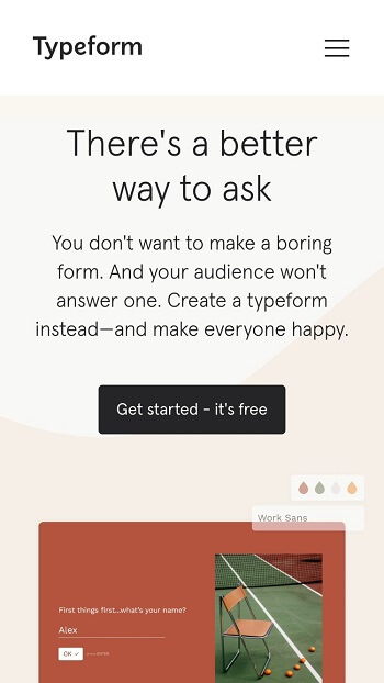
To reduce load times and provide a more straightforward mobile experience, Typeform has streamlined its mobile website.
Typeform, headquartered in Barcelona, is a digital firm whose stated goal is to "make forms awesome." Their desktop site is exquisite, welcoming users with terse language, pertinent animations, and other intricate design elements.
Typeform, however, understood that this intricate layout might cause website load delays and other issues for mobile visitors. So, many of them were taken away, making for a cleaner and more user-friendly mobile experience. Being a stripped-down alternative to the full desktop site, the mobile site has the same eye for design and usability.
3. Apple
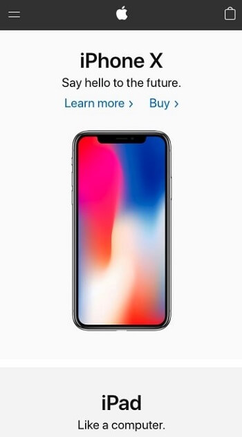
Apple, the tech giant, has made it a priority to develop a mobile website that allows customers to learn more about Apple goods quickly and conveniently.
Most of the sectioned pages on their site have a similar structure, which consists of a header, a subheader, and an image.
Its minimalism lends prominence to engaging product photography, drawing you into the products' streamlined style.
4. Etsy

Without overwhelming first-time visitors, this mobile site provides prominent calls to action for its site search, product categories, and trending goods.
Etsy is an online marketplace for the sale and purchase of vintage and handcrafted goods. Most shoppers on Etsy are either looking for a specific product or perusing other categories to find something that piques their interest.
5. Purple

The mobile version of Purple's website is designed to draw attention to the features that set their bedding apart from the competition.
If you're only interested in the essential information, you may skip down to the "hero" section on each product page and discover the four most important facts there.
Since "if you don't present your product, it doesn't exist," Purple also used original product photos to demonstrate how their bedroom accessories contribute to your sense of ease.
6. Adrian Zumbrunnen

Unlike most people, Adrian Zumbrunnen has designed a personal website from the ground up with mobile users in mind.
Adrian Zumbrunnen is a user experience (UX) designer, author, and public speaker; this is his personal website. His website has a special feature that sets it apart from the rest: it's designed to be a dialogue.
7. Warby Parker

Warby Parker, another popular online retailer, does a great job of describing its items without overwhelming the viewer with unnecessary information.
This allows customers to look through options based on their preferred aesthetic (which, let's be honest, is the essential factor when purchasing eyeglasses) while still having the option to click for further information.
Its mobile menu is organized in the same fashion, with just three main options (Try-on, Eyeglasses, and Sunglasses) with prominent images to highlight their relative importance.
8. Evernote

Evernote's mobile site makes it obvious what it's for and how to sign up, with a straightforward conversion path and a clean design that carries over from the desktop version.
With Evernote, you can save and retrieve your notes, photos, and web clippings from any of your devices. For this reason, it is crucial that Evernote provides a great mobile experience across all platforms, as consumers often install the app or visit the website on more than one device (desktop, smartphone, tablet).
9. Adobe

Adobe's mobile site prioritizes the company's own software, making it easy for visitors to learn about the many sorts of solutions available and decide whether or not Adobe's products are a good fit.
You can see this clearly on the mobile menu, as Adobe categorizes its items before getting more specific when you click on each individual item.
When you select one of these links, you'll be sent to a website with further information on the product, such as its features and any relevant case studies.
As a result of your potential interest in exploring various sites that fall under that product category, Adobe has included a dedicated mobile menu that lists them and remains in place as you scroll.
10. Pixelgrade
The WordPress themes from Pixelgrade are modern, minimalist, and responsive. The Pile theme, in particular, is well-suited to WordPress portfolios.
The mobile-friendly Pile theme from Pixelgrade is ideal for showcasing your work and services. The theme works well on mobile devices without sacrificing the aesthetic or message you were going for.
Part 4. 7 Mobile Website Design Tips
Mobile devices now drive more than half of all internet traffic, which means creating a mobile-friendly website is no longer an option but a necessity.
Here are 7 effective mobile web design tips to help you optimize your website for mobile users.
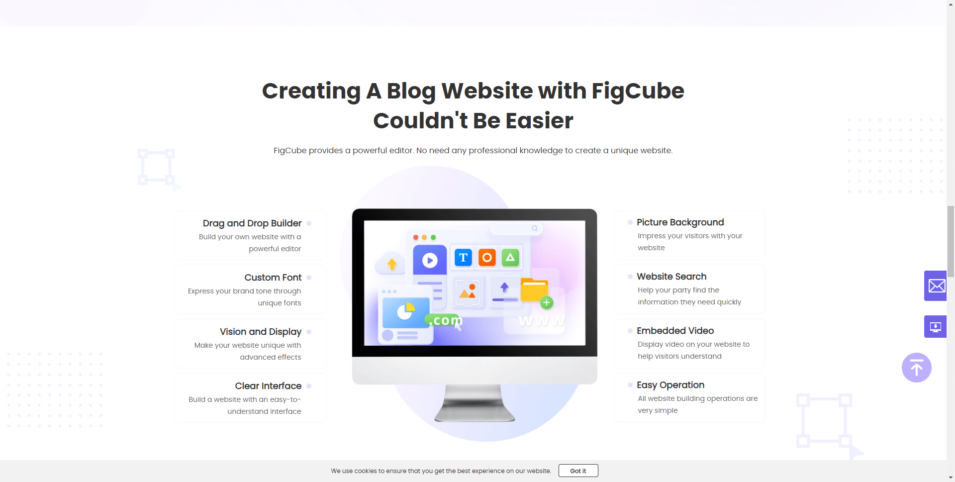
Choose the Best Mobile-friendly Website Builder like Figcube
FigCube is a blog website builder for e-commerce users to gain free SEO traffic. It provides an intuitive drag and drop builder, mobile responsive templates, and powerful tools to help you quickly build an attractive mobile website.
Use a Mobile Responsive Design
A mobile responsive design is crucial for today's websites. Responsive design ensures that your website looks great on all devices, no matter how big or small the screen size is. It allows your website to adapt to different screen sizes and device orientations, thus providing a seamless user experience across all platforms. Find out more tips on responsive web design by clicking Responsive Web Design: All You Need to Know to Craft a Seamless User Experience.
Using site responsive design also helps with SEO, as search engines prioritize mobile-friendly websites.
Simplify Navigation
Mobile users have limited screen space, and they need to find what they are looking for quickly and easily.
Having a clear, properly organized navigation menu ensures that users know where to go for what they want. Keep the navigation bar simple, use clear language, and limit the number of menu items to avoid confusion.
Optimize Images
Images can make your website visually appealing and engaging, but they can also slow down website speed, which can be frustrating for mobile users. Optimize images to minimize file sizes without compromising on quality.
You can use a tool like ImageOptim to compress images or use image formats that load faster, such as PNG or WebP.
Speed up Your Website
Speed is critical for any website, but particularly for mobile users. Slow-loading sites frustrate users and cause them to leave. Use tools like Google PageSpeed Insights to identify issues with your website and optimize it for speed.
Some quick tips to improve speed include reducing image sizes, minimizing the use of JavaScript, using caching to store frequently accessed data, and optimizing server response times.
Use Clear Typography
Clear typography makes your content easier to read and understand, even on small screens. Opt for larger fonts that are easy to read, and choose fonts that are compatible with mobile devices.
Also, avoid using too many different font types or sizes, as this can cause confusion and make your website look cluttered.
Maintain Consistent Branding
Brand consistency is vital for building trust and brand recognition with customers. Maintain consistent branding across different platforms, including mobile.
Ensure that your logo, color scheme, and other branding elements are recognizable and easy to spot on a mobile screen.
Use a Minimalist Design
Minimalist design can make your website look more professional, reduce clutter, and better prioritizes your content.
Use minimalist designs to make your website appear more organized and sophisticated. Simplify the user interface, use white space, and avoid overloading pages with too many elements.
With Figcube, you can implement all these best practices to build a fast, easy to use mobile website that represents your brand well and delights customers on the go. Their professional services and powerful tools provide an all-in-one solution for crafting a successful mobile user experience.
Conclusion
A mobile-friendly website is crucial to the success of any business with an online presence. It allows companies to reach a larger audience, improve their SEO rankings, and offer a better user experience that can ultimately increase customer engagement and conversions.
The key to designing a mobile-friendly website is to focus on user experience. Keep in mind the needs of mobile users who are often in a hurry and need quick access to relevant information.
Use mobile responsive design, simplify navigation and typography, optimize images and speed, maintain consistent branding, and utilize minimalist designs. With these tips, you can create a mobile-friendly design that engages and delights your users.
(Click to rate this post)
Generally rated 5 (256 participated)
Rated successfully!
You have already rated this article, please do not repeat scoring!