


 Shop
Shop
Responsive Web Design: All You Need to Know to Craft a Seamless User Experience
Category: Web Design

9 mins read
In the world of technology, websites are accessed through a wide range of devices, from desktop computers to smartphones and everything in between. As such, websites must fit different screen sizes and resolutions. Responsive web design solves this challenge, providing a seamless user experience that adapts to different devices.
Today, we will explore the ingredients, principles, and steps necessary to make a website responsive. By the end of this article, you will have the knowledge and recognize the tools needed to create a website that provides a consistent and optimized user experience, regardless of the device being used.
In this article:
Part 1. What is Responsive Web Design
Responsive web design is a modern approach to designing and developing websites that respond to all user devices, screen sizes, and orientations. The concept of responsive web design is based on the idea of creating a website that can adapt to different devices without losing its functionality, readability, or user experience.
In other words, this design approach allows a website to respond to the user's behavior and environment, providing an optimal viewing experience regardless of the device being used.
How Responsive Websites are Created
To achieve this, responsive web design combines flexible grids, fluid layouts, and media queries. These techniques enable web designers to create a website that can adjust its layout, images, and text to fit the screen size of the user's device.
- Flexible grids allow the website to adjust its layout and content to fit the screen size of the user's device.
- Fluid layouts enable the website's elements, such as text, images, and videos, to scale up or down proportionally, depending on the screen size.
- Media queries are used to detect the user's device and screen size and apply appropriate styles accordingly.
The concept of responsive web design is not only limited to the technical aspect of creating a website but also involves user experience (UX) design. Responsive web design aims to provide a seamless and consistent user experience across all devices. This means the website must be easy to navigate, readable, and visually appealing, regardless of the device being used.
Moreover, responsive web design is a dynamic and ongoing process rather than a one-time task. As new devices and screen sizes are developed, responsive web design must evolve to meet the changing needs of users. This requires continuous testing, monitoring, and updating of the website's design and functionality.
Part 2. What is the Difference Between Responsive Web Design vs. Adaptive Design
Responsive web design and adaptive design are two popular approaches to creating websites that can adapt to different devices and screen sizes. While both approaches aim to improve the user experience, there are significant differences between the two.
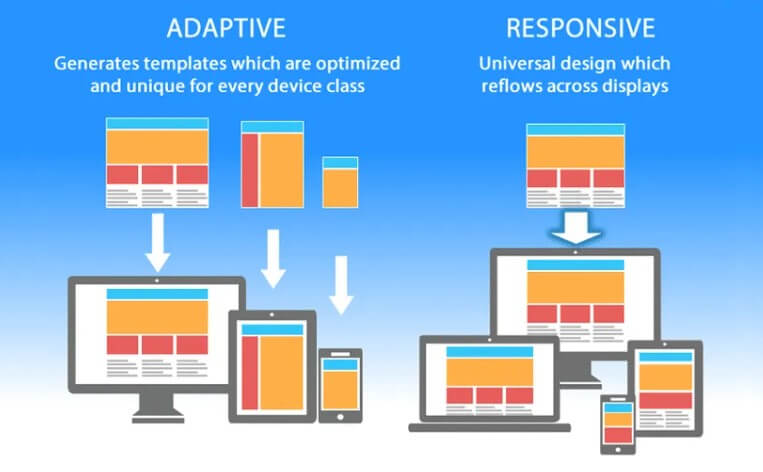
Difference in Layouts
Responsive website design services include a fluid and flexible layout that can adjust to the user's screen size, whether they are using a desktop computer, tablet, or smartphone. It relies on a combination of flexible grids, fluid layouts, and media queries to achieve this. The design responds to changes in the user's screen size, automatically adjusting the layout and content accordingly.
On the other hand, the adaptive design uses a set of predefined layouts that are designed for specific screen sizes. When users access a website, the system detects their device and loads the appropriate layout. This approach often involves creating multiple versions of the website, each optimized for a specific device or screen size.
Design Flexibility
One of the main differences between responsive web design and adaptive design is the level of flexibility. Responsive web design provides a more fluid and dynamic user experience, allowing the website to adjust to any screen size. Adaptive design, on the other hand, offers a more controlled experience, as each layout is designed for a specific device or screen size.
Approach to Content Delivery
Another significant difference is the approach to content delivery. Responsive web design delivers the same content to all users, regardless of device or screen size. Adaptive design, on the other hand, may deliver different content to different users, depending on their device and screen size.
Part 3. Why We Need Responsive Web Design
Responsive web design has become a crucial aspect of modern web development, and there are several reasons why we need it. Here are some of the key points:
Mobile Usage
With the widespread use of smartphones and tablets, people are accessing the internet on mobile devices more than ever before. Responsive web design ensures websites are optimized for these devices, providing a seamless and consistent user experience.
Cost - Effectiveness
Responsive web design allows web developers to create a single website that can be accessed from any device rather than creating multiple versions of the same site. This approach can save time and money while still providing a high-quality user experience.
SEO
Google prioritizes mobile-friendly websites in its search engine results, meaning that websites that are not optimized for mobile devices may be penalized in search rankings. Responsive web design can improve a website's search engine optimization (SEO) and increase its visibility.
User Experience
A responsive website provides a seamless and consistent user experience, regardless of the device used. This enhances user engagement and improves the chances of converting visitors into customers.
Future - Proofing
Going for a responsive website development company is an investment for the future, as they ensure websites can adapt to new devices and screen sizes as they emerge. This helps to future-proof a website and ensures it remains relevant and accessible to users for years to come.
Part 4. Responsive Web Design Ingredients
Responsive web design is a complex process that involves several essential ingredients to create a website that can adapt to different devices and screen sizes. In the ever-evolving world of web design, responsive design has become a crucial element for creating websites that work seamlessly across a wide range of devices. The ingredients that make up responsive web design are fluid layouts, responsive units, flexible images, and media queries.
Fluid Layouts
Fluid layouts are like the chameleons of web design. They allow designers to create layouts that can adapt to the user's screen size, ensuring the website's elements remain legible and visually appealing, regardless of the device used to access it. Fluid layouts are like gymnasts that can bend and twist, providing a seamless and enjoyable user experience.
With fluid layouts, designers can create dynamic, flexible designs that respond to different screen sizes and resolutions. Fluid layouts are especially important for websites with complex patterns, layouts and multiple elements. Designers can ensure the website's elements do not overlap or become distorted on different screen sizes. This provides a smooth and uninterrupted user experience, regardless of the device used to access the website.
Responsive Units
Responsive units are like the building blocks of responsive web design. They allow designers to create flexible and adaptive layouts that adjust to different device sizes and resolutions. These units are like puzzle pieces that fit together to create a beautiful and functional website, regardless of the device used.
Responsive units come in many forms, from percentages to ems to rems. These units allow designers to create layouts that adapt to the user's screen size, ensuring the website's elements remain legible and visually appealing. By using responsive units, designers can ensure the website's layout and design remain consistent across different devices, making it easy for users to navigate and interact with the website.
Flexible Images
Flexible images are like the acrobats of web design. They allow designers to create images that adapt to the user's screen size, guaranteeing the website's visuals remain clear and appealing, regardless of the device used. Flexible images are like contortionists that can twist and turn, providing a seamless and immersive visual experience.
With flexible images, designers can create visuals that are optimized for different devices without compromising image quality. By using flexible images, designers can confirm that images remain proportionate and do not become distorted on different screen sizes. This provides a visually stunning and uninterrupted user experience, regardless of the device used.
Media Queries
Media queries are the secret sauce of responsive web design. They allow designers to add different styles and layout configurations depending on the device's characteristics, such as screen size, orientation, and resolution. These little bits of code are like a chameleon that can adapt to its environment, transforming the website's appearance to fit the device's dimensions.
With media queries, designers can experiment with a variety of design options, from repositioning elements to changing font sizes, to hiding or showing different content. By adjusting the layout and design, designers can make sure the website's elements remain legible and visually appealing across a wide range of devices.
Part 5. Responsive Web Design Principles
Responsive web design is a must-have in the modern world of web development. It allows websites to adjust and adapt to different devices and screen sizes, providing an optimal user experience. But creating a responsive design is not just about making a website look good on different devices.
Let's take a look at some of the principles a responsive web design company should follow:
Content Strategy
This strategy involves understanding the target audience and designing the website's content to meet their needs. This includes identifying the user's goals, the website's objectives, and the content that will most effectively achieve these goals.
By focusing on the content first, designers can ensure the website's design supports and enhances the user's experience rather than getting in the way.
Select the Right Web and System Fonts
Fonts play a significant role in the website's overall look and feel, and choosing the wrong font can have a negative impact on the user's experience. When selecting web fonts, designers should consider factors such as legibility, readability, and compatibility with different devices and browsers.
System fonts are also an excellent option for responsive designs, as they are already installed on most devices, guaranteeing that the website's typography looks consistent across different devices.
Conducting Tests for Responsive First Fold
The first fold is the portion of the website that is visible without scrolling, and it is crucial to confirm that this portion of the website is optimized for different devices. Conducting tests for responsive first fold involves testing the website's layout and design on different devices to ensure it looks and functions well on each device. This includes testing for different screen sizes, resolutions, and orientations.
Performance Optimization
It involves optimizing the website's code, images, and other assets to make sure the website loads quickly and functions smoothly on different devices. This includes optimizing images for different screen sizes, using compression techniques to reduce file sizes, and minimizing the number of HTTP requests.
By optimizing performance, designers can make certain that the website is fast and responsive, regardless of the device used to access it.
Part 6. How to Make Your Website Responsive
Making a website responsive is a complex process that requires careful planning and execution. Here are some steps that can help you make your website responsive:
Define Your Goals
Before you start making your website responsive, it is vital to define your goals. What do you want to achieve with your website? Who is your target audience? What devices are they using to access your website? Defining your goals will help you make informed decisions about your website's design and functionality.
Choose a Responsive Design Framework
There are many responsive design frameworks available, such as Bootstrap, Foundation, and Materialize. These frameworks provide pre-built templates and components that can help you create a responsive website quickly and efficiently.
Optimize Your Images and Media
Large images and media files can slow down your website and make it difficult to load on mobile devices. You can use compression tools to optimize your images and media to reduce their file size without sacrificing quality. You should also use responsive images that adjust their size and resolution based on the user's device.
Use a Mobile-First Approach
When designing your website, start with the mobile version first. This will help you prioritize the most important elements of your website and ensure they are accessible on smaller screens. Once you have a mobile version of your website, you can then expand it to larger screens.
Must Use Fluid Layouts and Flexible Grids
To make your web responsive, use fluid layouts and flexible grids that adapt to different screen sizes. This involves using percentage-based widths and heights instead of fixed pixel values. You can also use CSS media queries to adjust your website's layout and design based on the user's device.
Prioritize User Experience
A responsive website design must prioritize user experience to ensure visitors can easily navigate the website and find the information they need. This involves designing a website that is easy to use, visually appealing, and optimized for performance. A responsive website also requires considering accessibility for all users, including those with disabilities.
Test Your Website on Different Devices
Before launching your website, test it on different devices and screen sizes to make sure it performs well across all platforms. You can also use tools such as Google's Mobile-Friendly Test to identify any issues with your website's responsiveness.
Use Analytics to Track Performance
To confirm your website is performing well, use analytics tools to track user behavior and performance metrics such as page load times, bounce rates, and conversion rates. Use this data to identify areas for improvement and make necessary updates to your website.
Maintain Your Website
Responsive web design is an ongoing process that requires continuous maintenance and updates. Regularly check your website for broken links, outdated content, and performance issues. Make necessary updates to your website's design and content to make certain that it remains relevant and accessible to your audience.
Responsive Web Development: Ending Note
Responsive web design is crucial to website development in today's digital age. By embracing responsive web design principles and utilizing the necessary ingredients and steps, website owners can provide a seamless user experience that adapts to different devices and screen sizes. Responsive web design not only improves user experience but also helps businesses reach a wider audience, increase engagement, and ultimately drive conversions.
In short, as technology continues to evolve, responsive web design will become even more important, making it imperative for website owners to keep up with the latest trends and best practices. Responsive web design services can help you with your goal.
(Click to rate this post)
Generally rated 4.7 (256 participated)
Rated successfully!
You have already rated this article, please do not repeat scoring!